| Author | Thread |
Comments Made During the Challenge  |
|
|
07/15/2007 05:25:35 PM |
|
 Photographer found comment helpful. Photographer found comment helpful. |
|
|
07/15/2007 02:34:53 PM |
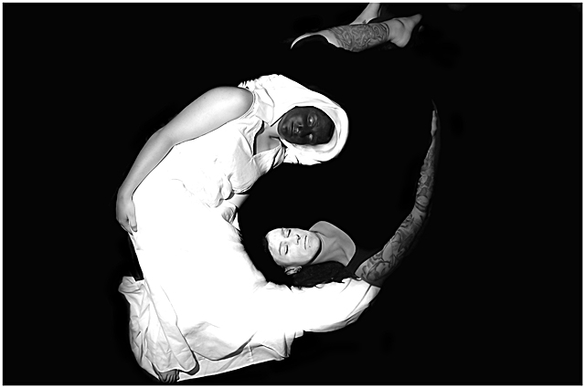
| Most interesting illustration of the ultimate dichotomy! The monochrome works, as does the contrast between the costumes and skin color of the models. Might have worked better with an African American model, or by putting the dark makeup on the models arms as well (would have ruined the dress, though...) Excellent work. 9 |
|
| Photographer found comment helpful. |
|
|
07/11/2007 06:57:08 PM |
|
| Photographer found comment helpful. |
|
|
07/11/2007 01:03:27 AM |
|
| Photographer found comment helpful. |
|
|
07/10/2007 11:39:00 PM |
| What a great idea! Nicely done. I wish the background wasn't black. I think a nice gray would have been perfect. |
|
| Photographer found comment helpful. |
|
|
07/10/2007 05:44:15 PM |
| Cool shot but a bit bright. |
|
| Photographer found comment helpful. |
|
|
07/10/2007 08:53:25 AM |
| great idea but in my opinion poorly executed, the black is drowned out into he background and the black face for this dot just isn't black enough to really bunch. |
|
| Photographer found comment helpful. |
|
|
07/10/2007 08:07:56 AM |
Wish I could do that.
The Black on Black though ruins it. Why not a gray background? |
|
| Photographer found comment helpful. |
|
|
07/09/2007 05:56:19 PM |
| Good idea, nearly pulled it off. |
|
| Photographer found comment helpful. |
|
|
07/09/2007 09:06:17 AM |
| This is a cool idea. The brightness of the white cloth is a bit overwhelming, and the blacks disappear into one another. I know it is a picture about contrasts, but I think a bit less would have been better. Having said that I think that the idea is really good, even though it is hard to pull off. Overall I gave you 6. |
|
| Photographer found comment helpful. |
|
|
07/09/2007 03:21:59 AM |
|
| Photographer found comment helpful. |
|
|
07/09/2007 03:03:09 AM |
| your exposure is a bit out which has made you lose detail in the white. But a very good example all the same. |
|
| Photographer found comment helpful. |
|
|
07/09/2007 12:23:59 AM |
| Would have prefered a square crop, and the toes to be in the frame. Otherwise this is very, very stunning. |
|
| Photographer found comment helpful. |
Home -
Challenges -
Community -
League -
Photos -
Cameras -
Lenses -
Learn -
Help -
Terms of Use -
Privacy -
Top ^
DPChallenge, and website content and design, Copyright © 2001-2026 Challenging Technologies, LLC.
All digital photo copyrights belong to the photographers and may not be used without permission.
Current Server Time: 02/01/2026 07:19:43 AM EST.