| Author | Thread |
Comments Made During the Challenge  |
|
|
01/20/2004 04:39:19 AM |
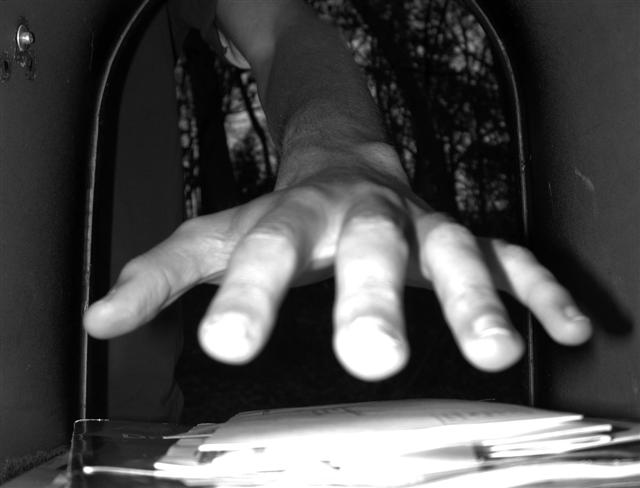
| Looks out of focus and the front of the picture is too bright - hard to have a subject that close to the onboard flash. |
|
|
|
01/19/2004 03:15:45 PM |
| would like the hand to be in focus more, but good idea |
|
|
|
01/19/2004 02:09:21 PM |
| Good idea. I wish the camera was focused on your fingers. |
|
|
|
01/18/2004 06:32:09 PM |
| good persepctive, but the mail and finger tips are way overexposed. Nice idea tho |
|
|
|
01/18/2004 04:09:38 AM |
| Cute, but a bit tentative... |
|
|
|
01/17/2004 02:49:31 PM |
| The high contrast b&w works well here, although its a bit blown out at the bottom so i cant see what the hand is grabbing |
|
|
|
01/15/2004 04:38:33 PM |
| good idea. the letters and figer tips are really over exposed though |
|
|
|
01/15/2004 05:30:12 AM |
| Ceratainly not a commonplace POV so meets challenge well. I would imagine that it was your intent to overexpose your fingertips? |
|
|
|
01/14/2004 02:43:01 PM |
| Maybe if the focus was a bit stronger on the finger tips? |
|
|
|
01/14/2004 03:58:25 AM |
| The hand looks freaky from ths point of view but I don`t like ,...ooops, sorry, I don`t like the title, I just see that this is in a post box, whow, now thats very clever!!! A very good idea. The flashlight makes a bit too much contrast in the front so that the detail of the letters and the fingertips are lost. But great idea anyway, respect! |
|
Home -
Challenges -
Community -
League -
Photos -
Cameras -
Lenses -
Learn -
Help -
Terms of Use -
Privacy -
Top ^
DPChallenge, and website content and design, Copyright © 2001-2025 Challenging Technologies, LLC.
All digital photo copyrights belong to the photographers and may not be used without permission.
Current Server Time: 04/07/2025 01:25:43 AM EDT.