| Author | Thread |
Comments Made During the Challenge  |
|
|
07/10/2007 12:26:06 PM |
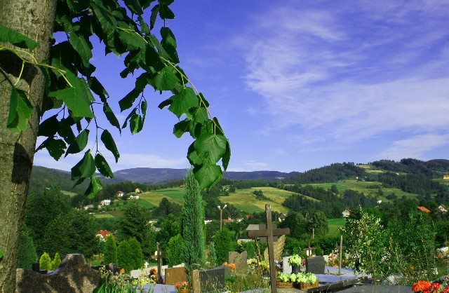
| This doesn't really work for me as an image. The composition feels messy - the foreground tree is tilted (which may be how it is in real life but when one can only see this small section of it, just makes the image feel unbalanced to me). The angle we have here makes the graveyard look cluttered and crowded rather than a peaceful resting place and the main cross we can see has it's bottom cropped out. It seems that you can't quite decide whether your subject is the foreground tree, the graves or the landscape beyond. |
|
|
|
07/10/2007 10:53:01 AM |
| try to control those blues in the sky |
|
|
|
07/09/2007 12:34:03 PM |
| This is a nice shot but the subject area is a bit cluttered which causes the image to loose impact. |
|
|
|
07/08/2007 03:54:16 PM |
| The tree branch in front is very distracting to the overall composition of your photo. |
|
|
|
07/07/2007 05:41:04 PM |
| I like the colors, but I miss the theme because it is so busy |
|
|
|
07/06/2007 04:54:49 PM |
| This is a great landscape shot. The blues in the sky are nice too. 8 |
|
|
|
07/05/2007 10:58:43 AM |
| very strange composition and crop, can't see what your main subject is |
|
|
|
07/04/2007 05:11:56 PM |
| The branches in the foreground distract for me. |
|
|
|
07/04/2007 09:50:10 AM |
| Nice colours and that looks like fabulous scenery in the background. For me, though, the foreground is far to busy and detracts from the image overall. |
|
 Photographer found comment helpful. Photographer found comment helpful. |
Home -
Challenges -
Community -
League -
Photos -
Cameras -
Lenses -
Learn -
Help -
Terms of Use -
Privacy -
Top ^
DPChallenge, and website content and design, Copyright © 2001-2025 Challenging Technologies, LLC.
All digital photo copyrights belong to the photographers and may not be used without permission.
Current Server Time: 04/07/2025 01:41:19 AM EDT.