| Author | Thread |
|
|
09/17/2002 08:01:00 AM |
| Que estas haciendo con mi hermana? |
|
Comments Made During the Challenge  |
|
|
09/15/2002 07:05:00 PM |
|
|
|
09/15/2002 01:32:00 PM |
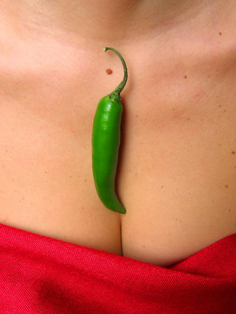
| I like mine hot :) I went with a similar theme this week... good shot :) - jmsetzler |
|
|
|
09/15/2002 11:52:00 AM |
|
|
|
09/14/2002 03:52:00 PM |
| I can't quite figger out why this picture isn't as sexy as it's supposed to be. |
|
|
|
09/14/2002 01:14:00 PM |
Composition - quite good
Technical Aspects - quite good
Meets Challenge - yes
Visual Impact / Originality – quite high
Other suggestions – fold is a little distracting
7
Jim msp
|
|
|
|
09/14/2002 09:41:00 AM |
|
|
|
09/14/2002 08:54:00 AM |
| Good use of color...the red makes a good contrast to the green. Good luck in the callenge. Gracious aka Grayce |
|
|
|
09/13/2002 02:13:00 PM |
| Well done shot, and I like clevage, but I do not really think they meld together effectively. |
|
|
|
09/13/2002 10:16:00 AM |
| Gorgeous color and witty composition! I learned from this photo the value of asymmetry, as illustrated in how the red sheet/cloth is kinked on the right - masterful touch! |
|
|
|
09/13/2002 06:24:00 AM |
| Well centered. Great use of mole in artisitic statement. |
|
|
|
09/13/2002 02:23:00 AM |
Material across bosom just the right colour against the skin and the chilli. And it's the little fold in the material to the right which makes this for me.
8, Kavey |
|
|
|
09/12/2002 05:18:00 AM |
| that's one of my favorite rectangles, love getting pictures of necklaces, pendants, nice. |
|
|
|
09/11/2002 05:51:00 PM |
Composition: Subject Placement, Cropping, Background7,
Technical: Focus, Exposure, Lighting, Processing9,
Appeal: Is it Interesting, Motivating, Etc.? 7,
Total Averaged Rating8. Autool
|
|
|
|
09/10/2002 03:18:00 PM |
| What a great concept! Love the photo, especially the stem wrapping around the mole. lhall-9 |
|
|
|
09/10/2002 01:36:00 PM |
|
|
|
09/10/2002 11:03:00 AM |
|
|
|
09/09/2002 11:49:00 PM |
Composition: Subject Placement, Cropping, Background good,
Technical: Focus, Exposure:good,
Appeal: low
Total Averaged Rating 6. sulamk |
|
|
|
09/09/2002 06:58:00 PM |
|
|
|
09/09/2002 04:29:00 PM |
| Fun, but the intensity of the red fabric seems to overpower the vegetable. |
|
|
|
09/09/2002 12:51:00 PM |
| Very good use of the colours I think. The composition lacks something although I am hard put to suggest a better one. Maybe cropping the start of the neck ? And reducing the highlight on the top left ? |
|
|
|
09/09/2002 10:36:00 AM |
I like the colors, very bright,,,but don't like the freckles on the skin or the mole. anddon't really get why there is a pepper on this person's butt.?
|
|
|
|
09/09/2002 07:24:00 AM |
| Fantastic shot – great ideaâ€Â¦ (8) |
|
|
|
09/08/2002 09:32:00 PM |
| I like the contrasting colors here. good job. |
|
Home -
Challenges -
Community -
League -
Photos -
Cameras -
Lenses -
Learn -
Help -
Terms of Use -
Privacy -
Top ^
DPChallenge, and website content and design, Copyright © 2001-2025 Challenging Technologies, LLC.
All digital photo copyrights belong to the photographers and may not be used without permission.
Current Server Time: 04/06/2025 10:33:10 PM EDT.