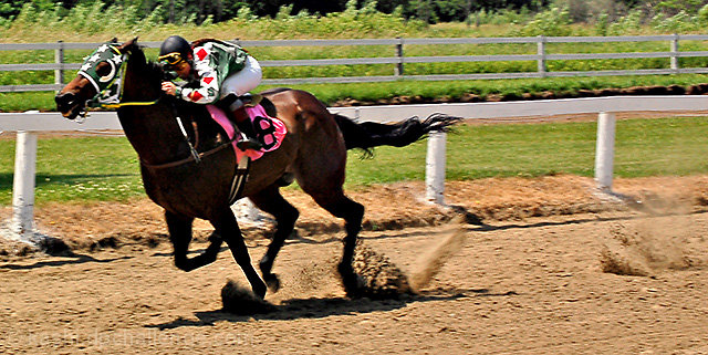
I think it's a great action shot esp with flying spurts of dust behind it. From a more tech viewpoint maybe people didn't like it running towards the left - here, we're so used to going left to right. In some countries horses do run widdershins - counter-clockwise, in non-archaic English, but to the best of my knowledge not in N. America. Did you flip the pic?
I'd personally wouldn't mind seeing more detail on the horse, but that's just me. :-)
For one thing, it looks like he's going the wrong way. In all the races I've seen, the horses go counterclockwise around the track. But that has nothing to do with the quality of the photo. I think you captured a great bit of action, with the tail flying, the weight of the horse so far forward, and the dirt spraying behind his hooves. The details of the horse and rider seem to be somewhat lost in the harsh contrast. It seems a good fit for the solo challenge.
I can't tell you what the voters were thinking, and I didn't vote this challenge, but here is what they have may been thinking, along with my reaction. Initially, I like the shot; it's a great point to be taking a photo, and you captured the elements well, from the hunched over rider to the dirt kicked up behind the horse itself. The not precisely horizontal horizon matches what you'd see at the track, and fits nicely with the feel of the image.
There are some things I've noticed, though (please don't worry that this is a bit long; I had some time on my hands). To start, there may have been some DNMC voters who thought "person+horse" does not equal solo. I don't agree, but it's a possibility. There are also a few things about this shot technically that I think may contributed to it placing where it placed. First, the panoramic crop isn't the strongest to me, especially with the horse about to run out of the frame. I might have tried a more traditional crop, and I may have tried to reverse it so that the horse was running into the frame (if you have the space in the shot); a different crop, one that may have put the horse/rider on a third, or perhaps even centered (to isolate it), might have given it more a feeling of "solo".
Both the focus and brightness here are a bit distracting to my eye. Nothing seems precisely in focus; yes, the horse was running, but she/he and the rider are not really blurred, either. Given the slight blurring in the posts in the background (which I like), I'm not sure if you tried motion panning, but the end result is slightly unsettling for me to look at. It almost looks over-sharpened (though you haven't sharpened it at all). For brightness and tones, the horse itself is a bit dark (and if I move my laptop monitor wrong, it looks noisy in the dark areas), and the white on the horse's head and on the rider's arms seems blown.
If I had voted, this would have gotten a six. I hope my thoughts can help you to see what the non-commenting voters may have seen (all this just my opinion, of course).