| Author | Thread |
Comments Made During the Challenge  |
|
|
06/25/2007 02:13:32 PM |
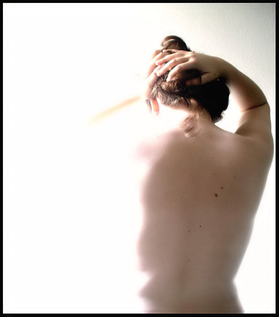
| A lot of people like these type of shots with the intentionally blown out areas but they're not a style I find favor with personally. I would have preferred to see at least an outline of her face. |
|
 Photographer found comment helpful. Photographer found comment helpful. |
|
|
06/25/2007 05:17:08 AM |
| harsh lighting hurts this one ... |
|
| Photographer found comment helpful. |
|
|
06/24/2007 01:05:11 PM |
| I like the subject. The border is a bit harsh for this soft photograph. Perhaps a more subtle color. |
|
| Photographer found comment helpful. |
|
|
06/21/2007 03:52:45 PM |
| Good example of negative space. The shapes of visible subject in turn create shapes of negative space. I don't like the composition, though, pushing her to one side like that. I see it often at dpc, and it is meaningless, or conveys a misunderstanding of negative space. |
|
| Photographer found comment helpful. |
|
|
06/20/2007 07:35:15 AM |
| the negative space has some depth, which is good. Focus is just a little softer than I would like it (I love soft focus images and do a lot of them but I'm not sure this works here). The black border is distracting and overpowering - I think that is why I have a problem with the soft focus. Works for the challenge. 6 |
|
| Photographer found comment helpful. |
|
|
06/19/2007 09:18:40 PM |
| at first i thought it was too blown but the more i look the more i like /8 |
|
| Photographer found comment helpful. |
Home -
Challenges -
Community -
League -
Photos -
Cameras -
Lenses -
Learn -
Help -
Terms of Use -
Privacy -
Top ^
DPChallenge, and website content and design, Copyright © 2001-2025 Challenging Technologies, LLC.
All digital photo copyrights belong to the photographers and may not be used without permission.
Current Server Time: 04/09/2025 03:02:47 AM EDT.