| Author | Thread |
Comments Made During the Challenge  |
|
|
06/24/2007 02:23:44 PM |
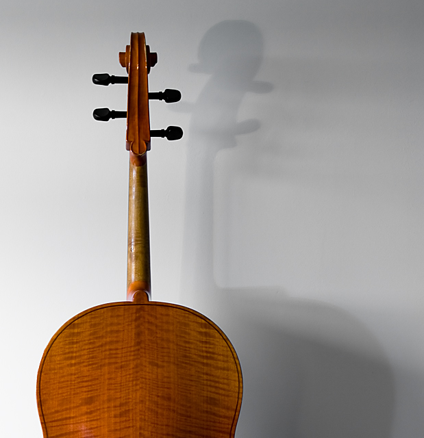
You have a great item there to work with (study). This example I'm afraid is rather boring. What could you do better? First the 'pose' is rather unimaginative. Give it a little more interesting angle. Try different angles to see what the effect is. Second the lighting is kinda boring. If ya moved it away from the wall and then put some lighting directly on the wall it would help to remove the multiple shadows that IMHO don't add to the shot. Move your subject lighting around a little more and maybe use some reflective lighting to fill and you would end up with more texture and depth. Play with it. It's digital and you have forever to practice right?
TC |
|
 Photographer found comment helpful. Photographer found comment helpful. |
|
|
06/23/2007 10:03:43 PM |
| Good idea. The shadow is a bit washed out by other light sources, but not too bad. |
|
| Photographer found comment helpful. |
|
|
06/23/2007 06:09:46 AM |
| Great idea with the repeating shadows, but the light/flash setup wasn't adjusted for the best impact. |
|
| Photographer found comment helpful. |
|
|
06/23/2007 02:14:03 AM |
| I like the shadow on the wall. Might have been better with only one light. That other shadow that starts farther right is distraction. Cool. |
|
| Photographer found comment helpful. |
|
|
06/21/2007 07:05:17 PM |
| HAHA. Love the title. The shadow works really well with the composition. |
|
| Photographer found comment helpful. |
|
|
06/20/2007 11:20:07 PM |
| i like that the cello and it's shadow pegs are high fiving each other. |
|
| Photographer found comment helpful. |
|
|
06/19/2007 01:44:51 PM |
| You should've tried to make the shadow a little more pronounced. Try to get a single shadow instead of two. 6 |
|
| Photographer found comment helpful. |
|
|
06/18/2007 08:03:53 PM |
| If the shadow was a bit more defined, this shot would be much more effective. However, it comes across as being a bit harsh in the lighting department. A very good idea, though. |
|
| Photographer found comment helpful. |
|
|
06/18/2007 04:38:07 PM |
| I like the idea, I feel you have missed a trick of not having a much more pronounced shadow |
|
| Photographer found comment helpful. |
|
|
06/18/2007 08:34:59 AM |
Nice take on the challenge, this truely is the side less seen! Nice image. The shadows on the wall are a tad distracting and I was told by a fellow DPCer when I had the same problem that it is better not to get an object you are photographing too close to a wall because it will generally create this 'problem'
Nice image though |
|
| Photographer found comment helpful. |
|
|
06/18/2007 03:10:36 AM |
|
| Photographer found comment helpful. |
Home -
Challenges -
Community -
League -
Photos -
Cameras -
Lenses -
Learn -
Help -
Terms of Use -
Privacy -
Top ^
DPChallenge, and website content and design, Copyright © 2001-2026 Challenging Technologies, LLC.
All digital photo copyrights belong to the photographers and may not be used without permission.
Current Server Time: 02/01/2026 11:07:41 AM EST.