| Author | Thread |
|
|
06/16/2010 10:45:56 PM |
| This is such a wonderful shot! |
|
 Photographer found comment helpful. Photographer found comment helpful. |
|
|
07/31/2008 04:46:59 PM |
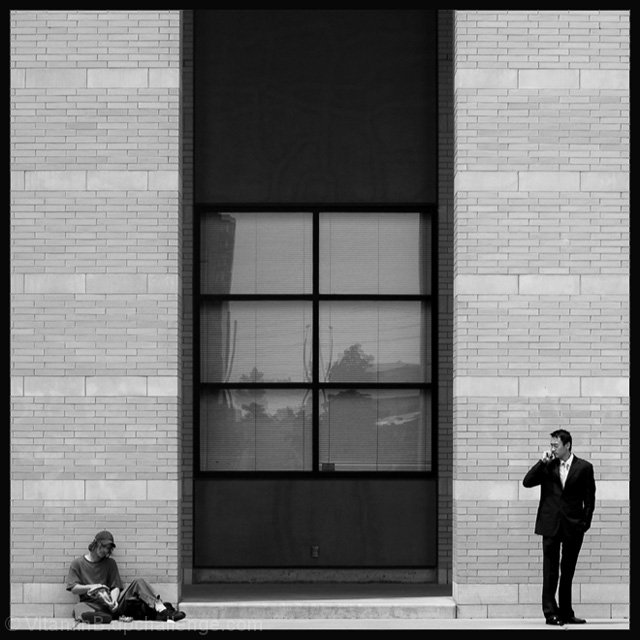
| This is an awesome shot for a lot of different reasons. I do have to echo one of the sentiments voiced below and say that the title detracts from the viewers perception of the image, but only because that concept is communicated so well visually. I also can't believe this doesn't have any faves, so allow me to be your first. |
|
| Photographer found comment helpful. |
|
|
06/27/2007 11:44:24 AM |
| Excellent composition and use of ns. (Agree could use more contrast/definition, and title was overdone, but the strength of the combined elements kind of overwhelms these niggles). Postures of your models dead on. |
|
| Photographer found comment helpful. |
|
|
06/27/2007 12:07:40 AM |
ahh man i'm sorry to see that a bunch of water droplet on flower pictures scored higher than this. this should've been on the front page! i posted it as one of my favorites from the challenge on this thread . well done, my friend!
Message edited by author 2007-06-27 02:38:18. |
|
| Photographer found comment helpful. |
Comments Made During the Challenge  |
|
|
06/26/2007 11:15:50 PM |
| Awesome. What a great capture. |
|
| Photographer found comment helpful. |
|
|
06/26/2007 10:18:05 PM |
| Nice. I like the meaning added to this shot. The gap in the negative space (the window) really adds to the effect too. |
|
| Photographer found comment helpful. |
|
|
06/26/2007 07:06:59 PM |
| negative space is a subtle but important part of the composition. It's like you have three canvasses, each with its own use of negative space. |
|
| Photographer found comment helpful. |
|
|
06/26/2007 04:25:09 PM |
| nice idea well illustrated |
|
| Photographer found comment helpful. |
|
|
06/25/2007 10:58:20 PM |
| You know - this is funny. I cannot believe I am about to write the following because I cringed when someone did it to me. But now I actually understand. I would have just gone with a simple title and let the viewer decide what kinds of gaps could be created here. Before I read your title, I saw the visual gap between the men and then I looked at the two men. My first thought was actually about job status. Like the working man on the right and what - a student or homeless person on the left? A very cool photo with lots to look at. Nice! |
|
| Photographer found comment helpful. |
|
|
06/24/2007 04:22:13 PM |
| b&w works well for this shot!! |
|
| Photographer found comment helpful. |
|
|
06/23/2007 10:57:15 AM |
| very nice!!!! I like this photograph, this shows a negative space!!! |
|
| Photographer found comment helpful. |
|
|
06/22/2007 09:41:54 PM |
| Top shot in the challenge. Hope to see this ribbon. |
|
| Photographer found comment helpful. |
|
|
06/22/2007 05:31:03 PM |
| this is very well seen, and well composed. interesting split composition. original. |
|
| Photographer found comment helpful. |
|
|
06/22/2007 04:06:11 PM |
| I love this interpretation, the negative space between the objects in both a physcial and economic sense. |
|
| Photographer found comment helpful. |
|
|
06/21/2007 11:30:38 PM |
I like this shot.
Was it on a hill? Something doesn't line up. I see that the horizon's dead on, but there's something telling my eyes it's off. Maybe it's the shadow in the center bottom.
Nice job. |
|
| Photographer found comment helpful. |
|
|
06/20/2007 06:19:06 PM |
| Terrific juxtaposition on several levels. I wonder if upping the contrast a bit would have even made it better? |
|
| Photographer found comment helpful. |
Home -
Challenges -
Community -
League -
Photos -
Cameras -
Lenses -
Learn -
Help -
Terms of Use -
Privacy -
Top ^
DPChallenge, and website content and design, Copyright © 2001-2026 Challenging Technologies, LLC.
All digital photo copyrights belong to the photographers and may not be used without permission.
Current Server Time: 02/01/2026 12:04:16 PM EST.