| Author | Thread |
Comments Made During the Challenge  |
|
|
06/10/2007 11:40:12 AM |
| Good title and meets the challenge, but kind of a lackluster subject and presentation. |
|
 Photographer found comment helpful. Photographer found comment helpful. |
|
|
06/09/2007 11:01:18 PM |
| Funny title. I like the idea but feel teh picture is a bit dark. |
|
| Photographer found comment helpful. |
|
|
06/07/2007 11:53:14 AM |
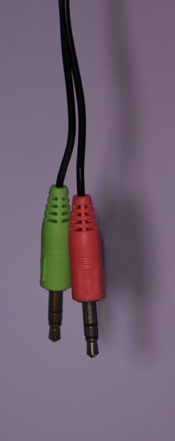
| pretty boring subject. tough to make this one look good. The lighting is also a little unidirectional, judging by the shadows. try using another light, or at least a reflector (can even be a piece of white cardboard or paper) to help even out the light. To improve this (forgetting about the subject), add in some more contrast and overall lighting through curves and levels adjustments. |
|
| Photographer found comment helpful. |
|
|
06/05/2007 10:37:25 AM |
| I think you should've used better lighting, and maybe bumped up the color saturation. Different light could've made the metal shine, while increasing the saturation would've made the red and green pop out. |
|
| Photographer found comment helpful. |
|
|
06/05/2007 02:55:43 AM |
| Nice title but the subject is far too boring and needs work technically too. |
|
| Photographer found comment helpful. |
|
|
06/04/2007 11:48:03 PM |
| A sparkling white background would make this image pop with those primary colors. |
|
| Photographer found comment helpful. |
|
|
06/04/2007 08:58:07 PM |
| The focus is very soft on this photo. |
|
| Photographer found comment helpful. |
|
|
06/04/2007 01:16:52 AM |
| The lighting is a little dull. I don't really like the crop either. Maybe bring the object farther away from the background, and try a different angle. |
|
| Photographer found comment helpful. |
Home -
Challenges -
Community -
League -
Photos -
Cameras -
Lenses -
Learn -
Help -
Terms of Use -
Privacy -
Top ^
DPChallenge, and website content and design, Copyright © 2001-2026 Challenging Technologies, LLC.
All digital photo copyrights belong to the photographers and may not be used without permission.
Current Server Time: 02/01/2026 10:52:24 AM EST.