| Author | Thread |
|
|
01/07/2004 06:00:45 AM |
Critique Club
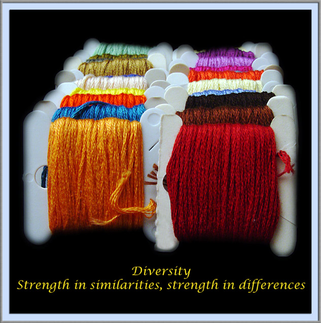
Hi. I think this picture shows a great array of colours, with an interesting repeating pattern. The focus and sharpness seems good in the photo, but where you have cut it out from the background you used a feathered tool. This ruins the sharpness in my opinion. It also makes it look more obviously photoshopped. Using an anti-aliased tool instead of feathered would help keep it looking sharp.
The centered composition isnt normally used in photography, but for posters I think it works okay, and is a good choice here.
I don't think the connection between the photo and the text is as strong as some others, but there is a link there. Personally, I don't like the font and colour that you used though. I think the main word, Diversity, should be bigger than the rest, because this is the main message you are trying to give. The font also looks a bit 'cliché' if you know what I mean? Is it Lucida Handwriting or something like that? I think a stronger font, or something a bit different to the norm, would have worked better. Also, Red or orange (as these are the prominent colours in the photo) may have worked better than yellow, or even a neutral colour such as white or grey.
Finally, I don't really like the choice of border. I dont think that you needed anything extra around the black, and if you had to have something, I would have thought a simple one colour border would have worked well, with a 1px keyline in another colour to separate it. |
|
 Photographer found comment helpful. Photographer found comment helpful. |
|
|
01/05/2004 04:26:40 AM |
| I placed this one much higher, nice image and good text, I like the sort of echo of the rainbow diversity symbol |
|
| Photographer found comment helpful. |
Comments Made During the Challenge  |
|
|
01/03/2004 07:14:55 AM |
| Excellent entry for this challenge. Love the colors, especially agains the black background. I also like the mat-style border - almost as if the print were already framed. I'd like to see what kind of difference it would make if the lower text line were split into two lines with a . . . connector. |
|
| Photographer found comment helpful. |
|
|
01/02/2004 11:01:12 PM |
| This will cater to a select group of people. Homely women. Remeber what your audience might see. |
|
|
|
01/01/2004 07:17:58 AM |
Great colors. Good message. Not thrilled with the border.
I wonder, if you had centered better on the thread so that the perspective was going straight back away from the viewer, if that would have improved composition? |
|
| Photographer found comment helpful. |
|
|
12/30/2003 10:01:44 AM |
| A nice composition in colors, and the wool has a beatiful, soft texture. Very pretty shot. |
|
| Photographer found comment helpful. |
|
|
12/29/2003 05:22:01 PM |
| i'm guessing you painted in the black around the edges - didn't come out too smooth and is somewhat distracting. |
|
| Photographer found comment helpful. |
|
|
12/29/2003 12:28:10 PM |
| Love the idea and the many colors. Your light is very good also. I don't really care for the vignette affect on the edges. Still not bad and I hope you do well. |
|
| Photographer found comment helpful. |
|
|
12/29/2003 06:51:10 AM |
| Good concept. IMHO, it will work better if the word "diversity" is bigger and of a different font than the others. |
|
| Photographer found comment helpful. |
|
|
12/29/2003 05:18:23 AM |
|
| Photographer found comment helpful. |
|
|
12/29/2003 04:06:03 AM |
| Colorful! I would have liked the quote better if it had said "our strength lies in our similarities" as it would have been better illustrated by the images. The differences in color does not add to the strength of these threads any more than it does in life. |
|
| Photographer found comment helpful. |
|
|
12/29/2003 12:47:32 AM |
| Oh, very good idea. Colours are just great. The border doesn't really go very well with your image. You have lots of colours happening, so simple border would have not competed for attention. Also, the text in yellow is a bit clownish. The main title should be bigger and different type face. If you've made simpler text and border, it would have been looking like a pro poster. |
|
| Photographer found comment helpful. |
|
|
12/28/2003 09:38:38 PM |
| looks heavily edited with photoshop |
|
|
|
12/28/2003 08:14:58 PM |
| Very apropos ... symbolism is strong and universal ... colors are great ... black background enhances the main elements. |
|
| Photographer found comment helpful. |
Home -
Challenges -
Community -
League -
Photos -
Cameras -
Lenses -
Learn -
Help -
Terms of Use -
Privacy -
Top ^
DPChallenge, and website content and design, Copyright © 2001-2025 Challenging Technologies, LLC.
All digital photo copyrights belong to the photographers and may not be used without permission.
Current Server Time: 04/07/2025 12:51:29 PM EDT.