| Author | Thread |
|
|
01/08/2004 04:12:09 PM |
| Despite the sheer persuasiveness of this image, it appears the irony was lost on the many. This too is hilarious. |
|
 Photographer found comment helpful. Photographer found comment helpful. |
Comments Made During the Challenge  |
|
|
01/02/2004 12:38:38 PM |
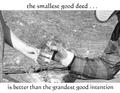
| Interesting textures and shapes. The sign is a bit close to the top, but is still the obvious center of interest. I'm not sure what it means, so don't really understand the allusion to creating a new problem. The sharpness is great except for the sign's shadow, which has a halo I'm guessing is from oversharpening; since spot editing was allowed for this challenge it would have been nice to avoid that. |
|
| Photographer found comment helpful. |
|
|
12/30/2003 07:44:34 AM |
| Nicely done. Text font/etc looks spot on. Might have chosen a slightly lighter colour? The sign is a little out of the pic, but I don't think that's a bad thing. Nice amount of texture and detail. |
|
| Photographer found comment helpful. |
|
|
12/30/2003 02:58:45 AM |
| Love it! Hope you get a prize. I'm not able to vote, but I'd give it a 10! |
|
| Photographer found comment helpful. |
|
|
12/29/2003 02:11:05 PM |
| This just isn't clear enough to me, and certainly isn't motivational. The image works well, but not in this context. |
|
| Photographer found comment helpful. |
|
|
12/29/2003 10:30:40 AM |
| I'm not sure I understand this one. |
|
| Photographer found comment helpful. |
|
|
12/29/2003 03:16:50 AM |
| One of my top picks. I love the humor of this shot. My only suggesion would be to have a tiny big more space on the top and less on the bottom which would bring the text up a bit. The shot has a great perspective and sharpness. Well done. |
|
| Photographer found comment helpful. |
Home -
Challenges -
Community -
League -
Photos -
Cameras -
Lenses -
Learn -
Help -
Terms of Use -
Privacy -
Top ^
DPChallenge, and website content and design, Copyright © 2001-2026 Challenging Technologies, LLC.
All digital photo copyrights belong to the photographers and may not be used without permission.
Current Server Time: 02/01/2026 09:25:23 AM EST.