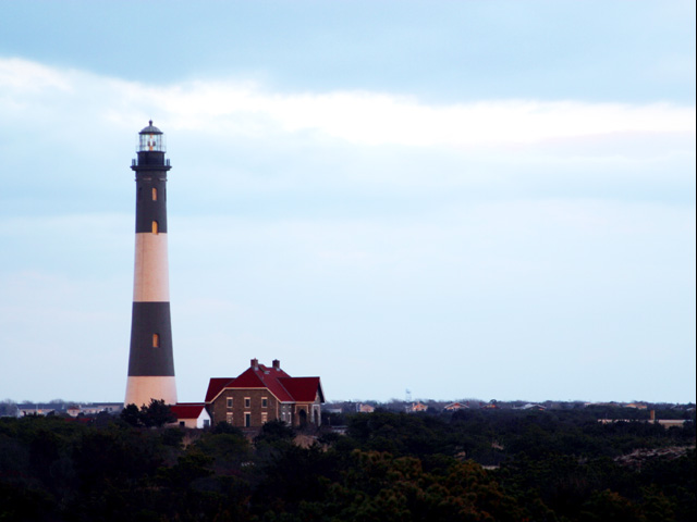
Initial thoughts/My opinion Lighthouses are always great. Colour somehow odd, too soft and the house next to the lighthouse disturbs. Title is nice, but I do not get a "guiding home" feeling.
Content/Composition The content of your submission is of course well chosen for the title: lighthouses and "not getting lost" always work together well. However, this feeling does not come up in me: there are several things that disturb. Each thing only a little but combined they do it a lot.
First there is the colour: the image seems to be taken either in the morning or evening with the orange glowing sun in the back. This glow is reflected in the lighthouse and the houses shown in the image. That's not bad, but it does not fit to the cyan of the sky. Selective desaturation might have helped here. Actually I would suggest B&W or some duotone image.
Next the problem for me is with the houses: by seeing them the "being lost" feeling is gone. It makes the lighthouse stand in a probably friendly neighbourhood, a guiding light for the wanderer is not needed. Especially the house next to the lighthouse results in me with this feeling.
Also if there are too many features in an image the viewers eyes walk around too much. However, they should just rest on the lighthouse.
I thing a different position, where the negative space (which is important for your image) is only sky and featureless earth or ocean would have worked better.
If there is now better position to find, drastic cropping is a possible solution.
Camera work -technically Camera-wise focus seems OK, but everything is too soft.
Exposure is very problematic here: you did use the full dynamic range from pure black to pure white/overexposed. Still, the lighthouse as focal point is too dark. +1 EV or even more would have of course made the sky brighter (that's OK) but also brighten up the houses. Again, a different point of view would have been helpful to get the lighthouse into the "right light" and the background dark.
Digital Processing - Technical The image for sure needs some more sharpening and it could have been improved considerably by changing brightness, contrast, colour saturation etc.
Also the addition of a border and the text would have been great here as one can see from the other submission for this challenge.
Fits the challenge Of course it does: main focal point of the image and the title work very well together, just some technical and compositional improvements should be made to make the image stand out more.
Good luck for you further submissions
PS: if there is any interest, I could put a suggestion from my side into my portfolio and we can discuss it. Just send me a PM.
I believe that you are using the lighthouse to communicate a notion of guidance, so why not take the shot at night when it's working? It would also have worked better if composed as a poster, but tyou probably missed the rules update.
Focus is soft. And maybe too much sky above the lighthouse. Too bad you didn't get the words on the photo, like a poster - I know the directions were a little hazy on this, but it would have looked good in white letters over th