| Author | Thread |
Comments Made During the Challenge  |
|
|
06/07/2007 09:46:15 PM |
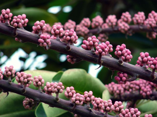
| i like the repeating shapes and colors of this one - but would like a little more constrast and better lighting on the buds in front |
|
|
|
06/06/2007 05:50:29 AM |
| Nice study of shapes and textures, but the composition isn't strong enough. What is the point of focus? The trick is to lead the viewer's eye and give it flow. Here, the eye is led out of the shot in several places... it's not clear what is really important and why we should spend a while looking at it. What does it communicate? |
|
 Photographer found comment helpful. Photographer found comment helpful. |
|
|
06/05/2007 04:36:01 PM |
| simple but nice. i think a bit more contrast would make this more interesting |
|
| Photographer found comment helpful. |
|
|
06/04/2007 09:41:37 PM |
| Bumping the contrast may help this one.. |
|
| Photographer found comment helpful. |
|
|
06/02/2007 12:30:57 PM |
| Interesting subject, but the color seems a little flat. |
|
| Photographer found comment helpful. |
|
|
06/02/2007 10:14:10 AM |
|
| Photographer found comment helpful. |
|
|
06/02/2007 09:13:07 AM |
I like the complementary colors of magenta and green, I like the strong diagonals, but overall the compostion is cluttered, the bright contrasting areas in the background are distracting
6
J |
|
| Photographer found comment helpful. |
|
|
06/01/2007 05:11:57 PM |
| Nice array but needs contrast. |
|
| Photographer found comment helpful. |
|
|
06/01/2007 03:18:10 PM |
|
| Photographer found comment helpful. |
Home -
Challenges -
Community -
League -
Photos -
Cameras -
Lenses -
Learn -
Help -
Terms of Use -
Privacy -
Top ^
DPChallenge, and website content and design, Copyright © 2001-2026 Challenging Technologies, LLC.
All digital photo copyrights belong to the photographers and may not be used without permission.
Current Server Time: 02/01/2026 07:42:23 AM EST.