| Author | Thread |
|
|
06/07/2007 07:58:37 AM |
Hey All,
Thanks a lot for all the comments - took me a coupe of days to notice them :)
Yes - lighting is VERY flat and for the life of me couldn't get it better. I had a flash wich I bounced off the ceiling. I still have a lot to learn as far as lighting goes.
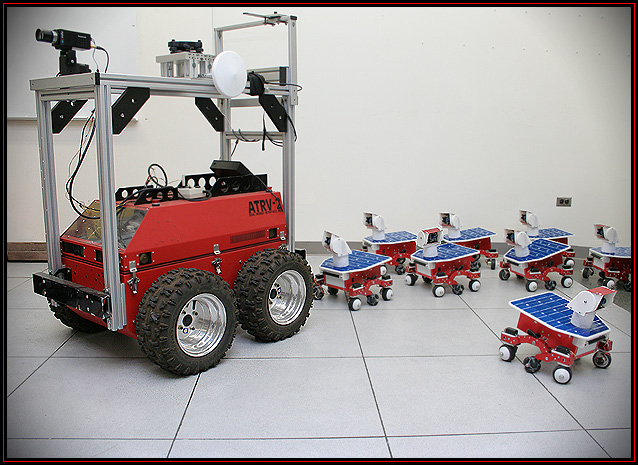
The composition though I did spend a lot of time on it, and I kind of like it like this :) My idea is that one of little robots strays away, and another one is looking after him as if to say "hey, what are you doing". I guess that detail gets lost a bit in the image
As for the vignette - I realised the image lacked "punch" so I added it in. Plus, I had never done it before and wanted to see how it's done. I guess it wasn't the best idea.
Finally - thanks again for the comments. There's a HUGE debate going on about voting and stuff right now, and this goes to show (if needed) where the real strength of this site is :) |
|
|
|
06/03/2007 05:40:06 PM |
Agreed. It's a six in my book as well.
The little 'robots' might be grouped in some discernible order. And this is nic picky, but since you have such a spare composition with lots of blank space, I think everything in the picture should work for a living. That means the electrical outlet should be in use (creatively) or concealed. Finally, it's hard for me to tell that the vignetting is part of the story?
Oh yes, I very much like the title. |
|
 Photographer found comment helpful. Photographer found comment helpful. |
|
|
06/02/2007 08:50:03 PM |
Great idea. I think perhaps you didn't think the composition thru completely before shooting the pic.
The lighting is kinda flat. Additional light from one side or above might help.
Composition wise. With all the Ducky refrences on this site, put the 'baby' robots in formation behind the mother with perhaps one lagging far behind.
Keep up the good work. |
|
| Photographer found comment helpful. |
|
|
06/02/2007 10:07:17 AM |
I would vote this a 6. It is technically very clean and sharp (except for the grey corners)-the contrast is good and the three main colours are strong. It definitely fits the challenge...
On the other side, it wouldn't go above a six because it doesn't excite me...this is purely personal preference, but I don't feel a connection to the picture-so 6 it is. |
|
| Photographer found comment helpful. |
|
|
06/02/2007 08:45:24 AM |
6, good concept, un-inspired lighting and composition, borders suck - just make it black.
improve: think out the composition and lighting. You might not have the equipment, but I can totally see this in a totally black room, with a hard light behind the big one and the small ones fanned out, creating shadows leading toward the camera, and a diffused light up front for fill and contrast. sweeeet.
Click Here for an example. |
|
| Photographer found comment helpful. |
|
|
05/28/2007 03:44:52 AM |
| Nice strong image. I like the vinyette. |
|
| Photographer found comment helpful. |
|
|
05/27/2007 09:48:06 AM |
Good. So it's more effective. You could call it: The next generation.
Ciao, Paolo. |
|
| Photographer found comment helpful. |