| Author | Thread |
Comments Made During the Challenge  |
|
|
05/29/2007 05:18:57 AM |
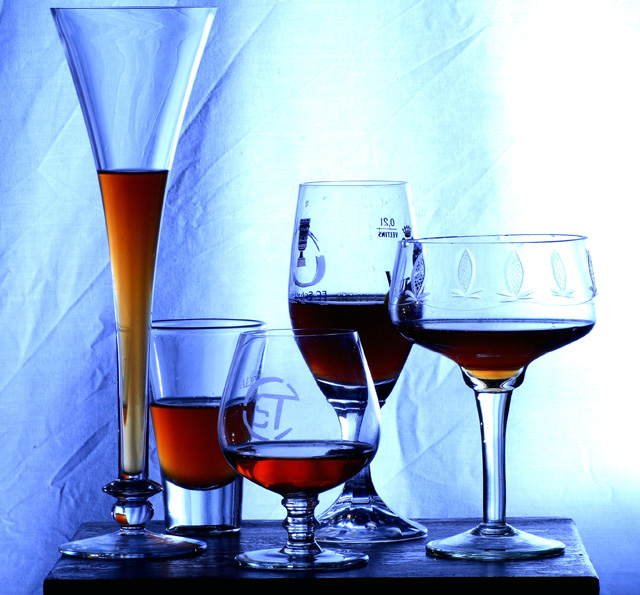
| I like the soft blues used in this picture as well as the lighting. |
|
|
|
05/28/2007 02:59:58 AM |
| I like the composition. Good choice of shapes and arrangement. The uneven lightng is distracting though, especially the washout on the right side. |
|
|
|
05/26/2007 02:25:44 PM |
Well done, I have 3 things to criticise (only in a positive way )
The light seems a bit harsh at the right
The background seems a bit creased
I have prefered some glass without text |
|
|
|
05/25/2007 06:08:15 PM |
| Good choice of subject for the challenge however the arrangement is too close to the backdrop (IMO). If it were further away then the creases would be more out of focus and blend more with the image. As they are they are a distraction. Also, the bright white area keeps drawing the eye away from the main subjects. |
|
|
|
05/24/2007 07:19:24 PM |
| The background lighting is too strong and overpowers this shot. |
|
|
|
05/24/2007 01:18:01 PM |
| Nice idea, and I love the different shaped glasses. However I really think a warmer light would have worked much better with the colour of the drinks, and the creases in the background are a little distracting as well. |
|
|
|
05/24/2007 06:47:17 AM |
| very clever one of the best,only it lacks a nice cold beer with a good head spilling over the side.i gave this an 8 |
|
|
|
05/23/2007 03:07:30 PM |
| nice ...but littel over exposed from the right side which kills the last details engravings on that right side one.........9 |
|
|
|
05/22/2007 09:24:27 PM |
| the wrinkled sheet hurts this image, pretty good focus and nice composition |
|
Home -
Challenges -
Community -
League -
Photos -
Cameras -
Lenses -
Learn -
Help -
Terms of Use -
Privacy -
Top ^
DPChallenge, and website content and design, Copyright © 2001-2025 Challenging Technologies, LLC.
All digital photo copyrights belong to the photographers and may not be used without permission.
Current Server Time: 04/07/2025 10:33:15 PM EDT.