| Author | Thread |
Comments Made During the Challenge  |
|
|
05/27/2007 09:41:53 AM |
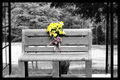
Lose the red inline and this would be more powerful. I think the inline really distracts/detracts from the shot.
TC |
|
 Photographer found comment helpful. Photographer found comment helpful. |
|
|
05/25/2007 03:44:30 PM |
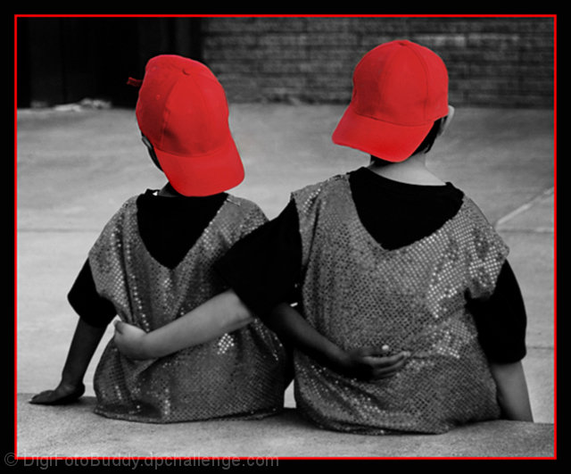
| i like the border. focus is a little soft. |
|
| Photographer found comment helpful. |
|
|
05/24/2007 08:20:20 AM |
| That's a nice image with an admirable theme, the caps make it, but it looks a little too soft, good luck |
|
| Photographer found comment helpful. |
|
|
05/22/2007 10:25:44 AM |
| Little too much saturation in the hats...the loss of detail is a little distracting. |
|
| Photographer found comment helpful. |
|
|
05/22/2007 09:52:42 AM |
| The focus seems a little soft and I'm not a fan of the red border. Nice concept though! |
|
| Photographer found comment helpful. |
|
|
05/21/2007 09:10:28 PM |
| IMO red is always a hard color to make fit in. It always to me looks too bright and hogs the picture |
|
| Photographer found comment helpful. |
|
|
05/21/2007 11:44:49 AM |
| Cute shot, but there seems to be some focus problems on the bodies, and I'd have backed off the red a bit in the hats... |
|
| Photographer found comment helpful. |
|
|
05/21/2007 09:01:15 AM |
| I would have left the red out of the frame. It keeps drawing my eye away from the subject. ...just a personal preference. Good photo, though. |
|
| Photographer found comment helpful. |
|
|
05/21/2007 07:49:25 AM |
| i wish the rest of the kids were more in focus- the hats are nice and crisp but the arms and bodies seem a little soft |
|
| Photographer found comment helpful. |
|
|
05/20/2007 08:41:52 PM |
| Cute moment, I think it would have been a stronge image if the focus was sharper. I think the red is very overpowering, may have reduced the saturation on it and perhaps didn't need to be repeated in the frame. |
|
| Photographer found comment helpful. |
Home -
Challenges -
Community -
League -
Photos -
Cameras -
Lenses -
Learn -
Help -
Terms of Use -
Privacy -
Top ^
DPChallenge, and website content and design, Copyright © 2001-2025 Challenging Technologies, LLC.
All digital photo copyrights belong to the photographers and may not be used without permission.
Current Server Time: 04/07/2025 09:37:14 PM EDT.