| Author | Thread |
|
|
06/02/2007 11:36:01 AM |
Greetings from the Critique Club
I looked with care at your image and while I was marshalling my thoughts, I decided to look at the comments you received on this photograph. Well, you were lucky enough to get a critique from  StDavidson and he said all the things I was going to say and then some! StDavidson and he said all the things I was going to say and then some!
So my critique is: do what StDavidson says to do, and by all means, continue to enjoy your DPC experience. |
|
 Photographer found comment helpful. Photographer found comment helpful. |
|
|
05/30/2007 11:14:46 AM |
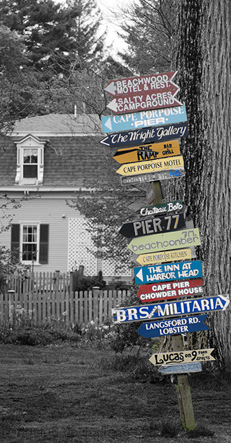
Positives:
Good selective desaturation concept and the tall framing works well.
Technicals:
You did a good job with the color boundaries, they look pretty natural and the colors don't appear oversaturated. You did well with black and white tonality. Sharpness is centered on the signs as it should be. (You'd be surprised how often we see images where that main subject is not properly focused)
The wire near the top of the sign is a distraction. The composition might be just a bit off with the positioning of the background tree.
The Challenge:
Duh! Meets the challenge all right. LOL!!! Does so with an appropriate use of selective desaturation to make a point.
Voters scored this smack dab in the middle of the road with a 5.4 score matching both the challenge average score given and DPC's overall average score given for all challenges.
Voters thought yours average for the challenge. I scored it a "7" which in my scheme of things means I think it is average as well. So in that regard I pretty much agree with the voters. For me, an image that meets the challenge and doesn't have any serious technical flaws will get an average score of "7" or it will get a higher score it does more than that. It is rare for me to find an image that flat out does not meet the challenge.
Suggestions:
Photography 101 - Always clone out distracting wires!
You can try some of the DOF suggestions I made above to see if you can achieve the effect you want.
Since you will have to re-take the picture to do that anyway then also try moving further to the right and recompose the shot. The reason for that is better placement of the background tree. Moving the sign more to the right of the tree will result in a better composition of image elements. Looks like you can position the sign right in front of the more distant branches to its immediate left so you still have the main part of the house unobstructed and the big tree will be further right.
Getting closer to the sign would be a good idea to and perhaps even necessary for shallower DOF. |
|
| Photographer found comment helpful. |
Comments Made During the Challenge  |
|
|
05/27/2007 03:37:28 PM |
| Neat idea! A little shallow depth of field might have been nice here, just to cut out all the distracting background details... but otherwise, this is pretty cool. |
|
| Photographer found comment helpful. |
|
|
05/22/2007 03:24:32 PM |
| wow, very interesting, 9. |
|
| Photographer found comment helpful. |
|
|
05/21/2007 04:20:32 PM |
| what a neat pic! i like it! |
|
| Photographer found comment helpful. |
Home -
Challenges -
Community -
League -
Photos -
Cameras -
Lenses -
Learn -
Help -
Terms of Use -
Privacy -
Top ^
DPChallenge, and website content and design, Copyright © 2001-2025 Challenging Technologies, LLC.
All digital photo copyrights belong to the photographers and may not be used without permission.
Current Server Time: 04/07/2025 02:00:45 AM EDT.