| Author | Thread |
|
|
05/29/2007 02:40:48 PM |
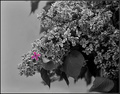
If you made this a print i'd be happy to hang it in my house.
Love the image and the title says it all... I wish I thought like you. |
|
 Photographer found comment helpful. Photographer found comment helpful. |
|
|
05/28/2007 03:31:57 PM |
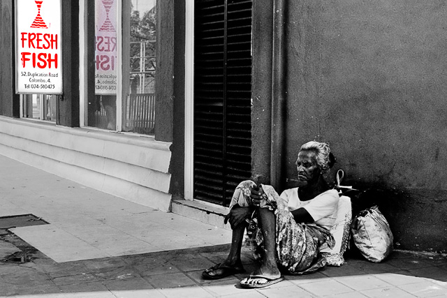
| I gave this a ten; it had something that I generally didn't like (the use of the color to force the viewer to look at a part of the image they might otherwise miss), but the real impact of that use was to force us to juxtapose that with the woman in a way we otherwise would not have. I love the starkness of the B&W, and the composition is spot on. I even liked the darker red in the reflection. Perfect, in my book, though probably way too out of the box for DPC. |
|
| Photographer found comment helpful. |
Comments Made During the Challenge  |
|
|
05/27/2007 10:56:00 PM |
| Very, very cool. Funny and sad and crazy at the same time. 9 |
|
| Photographer found comment helpful. |
|
|
05/27/2007 06:24:14 PM |
| Interesting social commentary. |
|
| Photographer found comment helpful. |
|
|
05/26/2007 11:50:16 AM |
| Why did you put the sign in color and not the person? |
|
| Photographer found comment helpful. |
|
|
05/25/2007 03:27:58 AM |
| An excellent concept. I hope this image does well, it should. |
|
| Photographer found comment helpful. |
|
|
05/24/2007 11:18:00 PM |
| Great! The coloration really has a purpose. |
|
| Photographer found comment helpful. |
|
|
05/23/2007 06:52:10 PM |
|
| Photographer found comment helpful. |
|
|
05/23/2007 01:20:53 PM |
| The sad face of poverty. I wish the person hadn't been so soft focus or am I missing the point of your intentions, perhaps I am. Good luck |
|
| Photographer found comment helpful. |
|
|
05/22/2007 04:00:16 PM |
| Good photo, but when you focre in the DeSat it looses so much |
|
| Photographer found comment helpful. |
|
|
05/22/2007 01:52:39 PM |
I had to come back to this photo because it is such a potent image. I'm not on board with your choice of color because it just seems so unrelated to the woman. I would rather this were all B&W, but since this is a selective desat challenge, something has to be in color, right? I think her bags or even her in color might have been a better choice, but that might come off as cheesy.
I originally voted this image a 5 with the intent to revisit it when I finished with the others. I'm not going to let the red sign be a speed bump in this image. It is just too good of a shot to have a "5," but for the challenge, the red sign does detract from the overall in my book. I'm bumping my vote to an 8. |
|
| Photographer found comment helpful. |
|
|
05/21/2007 05:14:22 PM |
| unique and interesting - I find it interesting how you left the sign's reflection also in color. Good contrasts, and nice shot. |
|
| Photographer found comment helpful. |
|
|
05/21/2007 03:12:00 PM |
| Interesting geometry, intersecting planes of reality and reflection. |
|
| Photographer found comment helpful. |
|
|
05/21/2007 01:12:39 PM |
|
| Photographer found comment helpful. |
|
|
05/21/2007 08:57:45 AM |
| That is really good how you didn't color the obvious. I really like it. |
|
| Photographer found comment helpful. |
Home -
Challenges -
Community -
League -
Photos -
Cameras -
Lenses -
Learn -
Help -
Terms of Use -
Privacy -
Top ^
DPChallenge, and website content and design, Copyright © 2001-2026 Challenging Technologies, LLC.
All digital photo copyrights belong to the photographers and may not be used without permission.
Current Server Time: 02/01/2026 08:52:21 AM EST.