| Author | Thread |
|
|
05/30/2007 11:46:10 AM |
Positives:
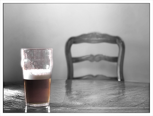
No beer drinker could disagree with the choice of color left for this selective desaturation composition. It is a perfect metaphorical choice that gives the viewer something to think about, particularly with the empty chair.
Technicals:
Composition is fine. The black and white tones are well rounded.
The toughest thing in color desaturation is getting the color boundaries right. In this case you had some problems, the color border does not look natural and the color left at the top of the glass is more distracting than not. The whole upper part of the glass above the beer level is particularly unnatural looking. Part of that might have been due to the lighting but probably not much.
Some folks may have thought the line in the table in the foreground was a distraction as well.
The Challenge:
Meets the challenge in a more meaningful way than most of the challenge entries. Voters no doubt gave you credit for that. Its the technical flaws that hurt this image more than anything else and garnered it a below average score.
Suggestions:
Probably the easiest thing would be to desaturate the top of the glass. The color up there is not very good to begin with and getting rid of it would no doubt correct everything wrong with the top of the glass.
To get a color border right you first need to measure the pixel width of surrounding boders. Just count the number of pixels wide the borders are. You may have to go to a 300%-400% view to see the pixels. You will want to set brush feathering compatible with that width when doing the color boundary.
If you could somehow do something with color and hue changes to give the beer a nice golden head that would work GREAT, but I suspect that would be to difficult to get right and look natural.
OK... I'm done with this one... bottoms up, everyone! |
|
 Photographer found comment helpful. Photographer found comment helpful. |
Comments Made During the Challenge  |
|
|
05/24/2007 11:51:59 PM |
| Is this a glass half full or half empty. Nice image. |
|
| Photographer found comment helpful. |
|
|
05/23/2007 06:08:46 PM |
| a slight rotation to the right would help this shot. i like that you didnt go for the bright red and bright green look, this is a nice subtle shot. |
|
| Photographer found comment helpful. |
|
|
05/21/2007 11:32:55 AM |
| Less is more... photographically speaking - but, ahem, less in the glass leads also to more inspiration, photographically speaking, of course, ;-) 9. |
|
| Photographer found comment helpful. |
|
|
05/21/2007 06:08:10 AM |
| would have had more impact to me if it had been on a bar. |
|
| Photographer found comment helpful. |
|
|
05/21/2007 03:15:46 AM |
|
| Photographer found comment helpful. |
|
|
05/21/2007 02:38:57 AM |
| I needed that during this challenge too... |
|
| Photographer found comment helpful. |
Home -
Challenges -
Community -
League -
Photos -
Cameras -
Lenses -
Learn -
Help -
Terms of Use -
Privacy -
Top ^
DPChallenge, and website content and design, Copyright © 2001-2025 Challenging Technologies, LLC.
All digital photo copyrights belong to the photographers and may not be used without permission.
Current Server Time: 04/07/2025 04:58:12 AM EDT.