| Author | Thread |
|
|
05/20/2007 11:29:35 PM |
Hey there from the Critique Club
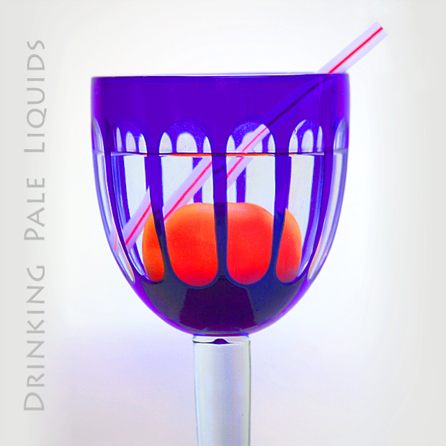
Camera Work/Technical: Nice focus and crisp colors. I do see some strange aberrations where the red and the blue meet up.
Lighting: Nice, even lighting. Your white background also works very well with this one.
Composition/Content: I also noticed the tilt, but I like that you chose to keep the waterline horizontal rather than the glass. It almost makes me want to see it tilted even more. I think that it would better fit the 'band' idea.
My Opinion: 5.6 is a pretty strong score for what you captured here. It serves better as a still life than something that makes me think album cover.
Thank you for the opportunity to provide a critique on your entry,
Eric
|
|
Comments Made During the Challenge  |
|
|
05/18/2007 10:09:42 AM |
| nice contrast but cant see this an album cover sorry |
|
|
|
05/17/2007 07:45:55 AM |
|
 Photographer found comment helpful. Photographer found comment helpful. |
|
|
05/16/2007 11:53:40 AM |
| I like the feel of this, very clean shot, saturation is about right, good use of text. |
|
| Photographer found comment helpful. |
|
|
05/16/2007 11:23:36 AM |
| The distortion is interesting here. The text slightly imbalances the presentation but I like the font used. |
|
| Photographer found comment helpful. |
|
|
05/15/2007 07:01:02 AM |
|
| Photographer found comment helpful. |
|
|
05/14/2007 05:11:27 PM |
| Cool colors, crisp and bright shot. |
|
| Photographer found comment helpful. |
|
|
05/14/2007 01:35:59 PM |
|
| Photographer found comment helpful. |
Home -
Challenges -
Community -
League -
Photos -
Cameras -
Lenses -
Learn -
Help -
Terms of Use -
Privacy -
Top ^
DPChallenge, and website content and design, Copyright © 2001-2025 Challenging Technologies, LLC.
All digital photo copyrights belong to the photographers and may not be used without permission.
Current Server Time: 04/07/2025 09:18:35 PM EDT.