Greetings from the Critique Club
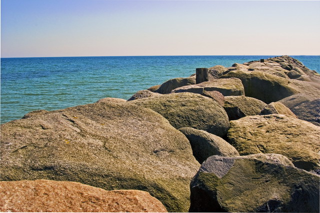
I love the shapes, forms, and textures of the boulders here. And the very different texture of the sea makes a great contrast. Good point of view; not too high and not too low. And the composition works well, although a touch of life would be nice. (I wish you could have coaxed a seagull to pose on that nearest piling!)
The colors here are great as well. I was wondering if black and white would be better since you then wouldn't expect the sky to be blue. And it might (although a good conversion that separates the rocks and water won't be easy), but the color adds so much here that it wouldn't have the same impact.
Yeah, the lighting is really tough here. Too bad you couldn't have come at a different time when the sun was lower and the light better. It would have made a huge difference here.
Also, there seems to be a lot of noise here that is dulling the sharpness this photo should have. A DLSR at ISO 100 shouldn't have this problem. I'm going to take a guess and say that it's from the slight rotate you did to get the horizon straight. (I can tell you did this from the white strips at the corners. And you didn't quite go far enough, although the slanted horizon isn't really apparent so it isn't a big deal.) Rotation has to interpolate, and with the textures here, the interpolation may have generated the noise. (Another possibility is that you don't have your camera set to save the highest quality possible and the noise is caused by JPEG compression artifacts.)
Overall, a nice photo. Not great, but certainly peaceful and enjoyable to look at. |