| Author | Thread |
|
|
05/22/2007 09:02:39 PM |
CRITIQUE CLUB CRITIQUE
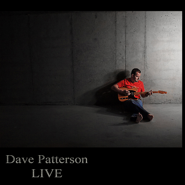
by karmat
Nicely shot.
Compositionally, I like your use of negative space and how the guitarist and text balance each other.
Technically, I like the colors and textures in this shot. I really, really like the concrete wall. For some reason, that really gives it an edge that would be lost with a typical photography background. The lighting is what I think is the strongest, though. It is dramatic without be overly so, or too harsh. The shadow is very effective as well.
So, I'm studying it to see what I could possibly suggest to get a higher score, and *wow* -- he's barefooted. That is cool.
I honestly don't know what I could suggest for improving this. I can only suspect that the one comment below that gave you a three for not having a "band" is the mindset of the other lower votes. I dunno. It never struck me that "David Patterson - -Live" couldn't be a band. But, then, I am just weird, I guess.
Nice work.
Karma |
|
 Photographer found comment helpful. Photographer found comment helpful. |
|
|
05/22/2007 08:12:03 PM |
| Good humor and a solid composition to make this image speak so well. Congratulations on your 11th place finish. |
|
| Photographer found comment helpful. |
|
|
05/21/2007 04:54:45 PM |
| Congrats, Tim - got a 7 from me. It really looks like an album cover. :) |
|
| Photographer found comment helpful. |
|
|
05/21/2007 09:34:09 AM |
Tim, this is GREAT! GREAT !!! Mega Congratulations such a great photo -- and finish.
|
|
| Photographer found comment helpful. |
|
|
05/21/2007 02:47:42 AM |
| Well done Tim, congrats on beating me once again :) |
|
| Photographer found comment helpful. |
|
|
05/21/2007 01:20:36 AM |
| Gorgeous lighting. Caught my eye immediately! |
|
| Photographer found comment helpful. |
|
|
05/21/2007 12:22:34 AM |
| This is so effective and so cool Tim, well done mate..... |
|
| Photographer found comment helpful. |
|
|
05/21/2007 12:18:27 AM |
| Darn just missed the top ten. |
|
| Photographer found comment helpful. |
|
|
05/21/2007 12:06:10 AM |
|
| Photographer found comment helpful. |
Comments Made During the Challenge  |
|
|
05/20/2007 02:29:22 PM |
|
| Photographer found comment helpful. |
|
|
05/20/2007 02:16:31 PM |
| Looks like something you'd find on the shelves at the local record shoppe. I'd give it a listen! 9 |
|
| Photographer found comment helpful. |
|
|
05/18/2007 08:52:33 AM |
| Not sure if I know who Dave Patterson is.....this is neat, though. Good job. 8 |
|
| Photographer found comment helpful. |
|
|
05/17/2007 05:34:44 PM |
|
| Photographer found comment helpful. |
|
|
05/17/2007 10:43:59 AM |
| Professional look! Believable! |
|
| Photographer found comment helpful. |
|
|
05/16/2007 04:05:23 PM |
| Nice lighting and balance. Good use of text. |
|
| Photographer found comment helpful. |
|
|
05/16/2007 01:27:27 PM |
| Very nice, it looks like a professionnal album cover. |
|
| Photographer found comment helpful. |
|
|
05/16/2007 10:53:22 AM |
| This is the first real album cover I've seen here. Right to the point... clean, colorful and stands out. I really like this. |
|
| Photographer found comment helpful. |
|
|
05/16/2007 06:38:46 AM |
| Great work. Can see it in record stores.....9 |
|
| Photographer found comment helpful. |
|
|
05/16/2007 06:23:53 AM |
| You know, you could slide the text up a bit, have it overlap the border... (just kidding!) Looks good. Maybe a wee bit soft on Dave, but love the setting. (Comment only, no vote.) |
|
| Photographer found comment helpful. |
|
|
05/15/2007 11:16:25 PM |
| One of the better band titles, I must say! |
|
| Photographer found comment helpful. |
|
|
05/15/2007 11:06:16 PM |
| Simply great. Less is definatly more. |
|
| Photographer found comment helpful. |
|
|
05/15/2007 12:55:47 AM |
|
| Photographer found comment helpful. |
|
|
05/14/2007 05:57:05 PM |
| Simple, effective, and tasteful. I can easily visualize this as a real album. Also, great job on creating an effective and non-contrived title. |
|
| Photographer found comment helpful. |
|
|
05/14/2007 04:39:24 PM |
| simple-effective-great lighting and emotive-cool shot! |
|
| Photographer found comment helpful. |
|
|
05/14/2007 04:26:49 PM |
Great image, very emotive, however, Dave Patterson implies a solo performer and Live is the album title, so Dave Patterson - Live doesn't cut it as a band name. I really hate to score it a 3, but feel I must.
(When can I hear the album?) |
|
| Photographer found comment helpful. |
|
|
05/14/2007 02:37:13 PM |
| Very well done, great choice of font. |
|
| Photographer found comment helpful. |
|
|
05/14/2007 10:02:06 AM |
| great....simple and great contrast....nuf said! 8-) |
|
| Photographer found comment helpful. |
|
|
05/14/2007 12:59:11 AM |
should do well, simple and effective.
although i feel the photograph is strong enough on its own with its shadows to not require the border. BUT it would change the feel of the image and would be hard to achieve the square crop.
one of the best |
|
| Photographer found comment helpful. |
|
|
05/14/2007 12:23:40 AM |
| Man, if THAT doesn't look like a real album cover!!!! |
|
| Photographer found comment helpful. |
Home -
Challenges -
Community -
League -
Photos -
Cameras -
Lenses -
Learn -
Help -
Terms of Use -
Privacy -
Top ^
DPChallenge, and website content and design, Copyright © 2001-2026 Challenging Technologies, LLC.
All digital photo copyrights belong to the photographers and may not be used without permission.
Current Server Time: 02/01/2026 07:55:05 AM EST.