| Author | Thread |
|
|
05/19/2007 05:05:24 AM |
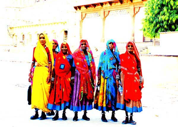
all i have learnt from this challenge is THIS IMAGE IS OVER SATURATED! i hope to submit more "dp" friendly images later sometime...... thanks for the comments!!!!!!!
and special thanks for the people who wrote "good" things about it.... :) ... |
|
|
|
05/16/2007 08:25:41 PM |
| pity, I too gave it a 9...sort of funny though, it was the first picture I voted on and actually voted it sort of low. I generally vote on all of them then go back and look at my rank breakdown and reconsider some votes....this one moved up CONSIDERABLY. Not sure why but it quickly grew on me...I guess more than anything it is an exercise in extremes in all senses and I really enjoy the subject/viewer relationship. |
|
 Photographer found comment helpful. Photographer found comment helpful. |
|
|
05/16/2007 03:02:53 PM |
a wonderful image, the super saturated colours and blown background work well here. the expressions on the women's faces are the perfect counterbalance to the heat of thier saris and the implied heat of the surroundings.
i gave this a 9, and it was greatly underrated by the masses. great work! |
|
| Photographer found comment helpful. |
Comments Made During the Challenge  |
|
|
05/15/2007 11:31:14 PM |
| It's not often I see anyone (else) around here play around with colors and contrast to this extent : ) |
|
| Photographer found comment helpful. |
|
|
05/15/2007 05:04:19 PM |
| Hmmm, it's so blown out...was that intentional? |
|
| Photographer found comment helpful. |
|
|
05/15/2007 09:02:12 AM |
| This is way too over exposed for me. |
|
| Photographer found comment helpful. |
|
|
05/14/2007 06:48:16 PM |
| Ow ow ow! My eyes. Turn it down! Way over saturated! Way to too much contrast! |
|
| Photographer found comment helpful. |
|
|
05/14/2007 11:54:42 AM |
|
| Photographer found comment helpful. |
|
|
05/13/2007 10:01:14 AM |
|
| Photographer found comment helpful. |
|
|
05/12/2007 07:12:17 PM |
| ur photo is on my top 5 list, cause i like that u took the risk of high contrast on people photo which ended up with a very good result. |
|
| Photographer found comment helpful. |
|
|
05/12/2007 07:52:14 AM |
| Very "washed out" exposure. |
|
| Photographer found comment helpful. |
|
|
05/11/2007 07:55:25 PM |
|
| Photographer found comment helpful. |
|
|
05/11/2007 01:44:24 PM |
| too much contrast, but nice idea |
|
| Photographer found comment helpful. |
|
|
05/11/2007 03:26:44 AM |
| background is too blown out IMO 6 |
|
| Photographer found comment helpful. |
|
|
05/10/2007 02:26:20 PM |
| I like the general idea of the picture, and even the composition is intriguing, IMO i just feel the background is very distracting a little to blown out. |
|
| Photographer found comment helpful. |
|
|
05/10/2007 12:34:12 PM |
its a bit to bright
i think that this picture would be nicer if you made the bacground sogter, and darker. the colors would have stood out no matter what. i like the idea though, id love to see the original. |
|
| Photographer found comment helpful. |
|
|
05/10/2007 11:25:24 AM |
| too much white.. burnout! |
|
| Photographer found comment helpful. |
|
|
05/10/2007 09:18:33 AM |
| too bad it's so overexposed. |
|
| Photographer found comment helpful. |
|
|
05/10/2007 12:59:28 AM |
| This would have been a nice photo if it wasn't so blown out. |
|
| Photographer found comment helpful. |
|
|
05/10/2007 12:57:35 AM |
| dig the composition, but the processing is extreme |
|
| Photographer found comment helpful. |
|
|
05/09/2007 02:36:15 PM |
| (Ouch!) puts sunglasses on....... saturation is out of control! Interesting grouping, however details are lost when balance is lost as it is here. This is a difficult effect to pull off effectively.... |
|
| Photographer found comment helpful. |
|
|
05/09/2007 02:29:23 PM |
| The colors on the dresses are nice, but the background is so blwon out that it ruins the image. Sorry 2 |
|
| Photographer found comment helpful. |
|
|
05/09/2007 11:49:58 AM |
| the background is way too bright! |
|
| Photographer found comment helpful. |
|
|
05/09/2007 11:36:06 AM |
| This image is too washed out. |
|
| Photographer found comment helpful. |
|
|
05/09/2007 11:31:43 AM |
| Interesting photograph. Love the colors and the arrangement. But the background lighting is a little harsh, which makes it sort of interesting but it would be nice if it was toned down a little bit. |
|
| Photographer found comment helpful. |
|
|
05/09/2007 10:12:54 AM |
| blown highlights hurt this image ... maybe a less centered composition also ... |
|
| Photographer found comment helpful. |
|
|
05/09/2007 09:02:47 AM |
|
| Photographer found comment helpful. |
|
|
05/09/2007 07:46:56 AM |
| IMO, I don't really like the blown highlights here. I think you might have been trying for a high-key shot with lots of great colors in the outfits, but it didn't quite make it. 5 |
|
| Photographer found comment helpful. |
|
|
05/09/2007 02:51:26 AM |
| Could have been a great piture if the background wasn't so blown |
|
| Photographer found comment helpful. |
|
|
05/09/2007 01:36:32 AM |
| I think the background is too burned out and therefore the costumes too isolated from their environment |
|
| Photographer found comment helpful. |
|
|
05/09/2007 01:12:03 AM |
| Image is overly contrasted and over saturated. The highlights are all blown out making the image unpleasing to the eye and leaving little area for the eye to rest. The subjects themselves are interesting. |
|
| Photographer found comment helpful. |
Home -
Challenges -
Community -
League -
Photos -
Cameras -
Lenses -
Learn -
Help -
Terms of Use -
Privacy -
Top ^
DPChallenge, and website content and design, Copyright © 2001-2026 Challenging Technologies, LLC.
All digital photo copyrights belong to the photographers and may not be used without permission.
Current Server Time: 02/01/2026 08:16:22 AM EST.