| Author | Thread |
|
|
06/08/2007 07:33:10 AM |
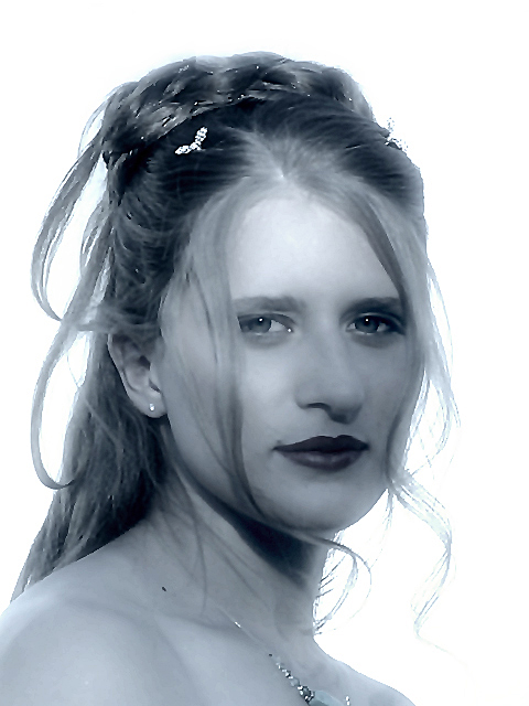
I think this was a good capture, and you achieved your goal of bring out the adult aspect of the girl.
I don't care for the processing. The hair looks glued together rather than soft and wispy as I imagine it really was. The contrast on the lips is very harsh (little detail of the mouth is visible) and the edges seem over sharpened. I also don't see any detail in the iris of her eyes. Maybe this is due to excessive noise reduction.
I'd like to see the original. I'll bet there are all sorts of good things you could do with it. |
|
 Photographer found comment helpful. Photographer found comment helpful. |
Comments Made During the Challenge  |
|
|
06/07/2007 05:40:39 PM |
| I think you used way too much neat image or a blur effect. It's over board IMO |
|
| Photographer found comment helpful. |
|
|
06/06/2007 08:56:18 PM |
| This had a lot of potential, but was hurt by the post-processing, particularly the noise reduction/neat image or similar. |
|
| Photographer found comment helpful. |
|
|
06/06/2007 12:29:49 PM |
| good portrait, but something looks off in the "focus." maybe adjusted the brightness or something too much in post processing? |
|
| Photographer found comment helpful. |
|
|
06/06/2007 03:24:55 AM |
| A bit too much noise reduction. |
|
| Photographer found comment helpful. |
|
|
06/05/2007 01:21:15 PM |
| Pretty girl. The lighting looks nice, but the processing looks overdone. Her eyes should sharp, but they look blurry. |
|
| Photographer found comment helpful. |
|
|
06/05/2007 07:48:09 AM |
| I think there's way too much shadow on her face. |
|
| Photographer found comment helpful. |
|
|
06/04/2007 12:49:17 PM |
fantastic lighting, great intense connection with her, but it appears you've oversharpened it - at least on my monitor. perhaps this in intentional and if so I like the almost retro look, but still doesn't get past the points above for me. I'd really like to give this an 8, but only a 6 due to the processing
Jack |
|
| Photographer found comment helpful. |
|
|
06/04/2007 10:35:44 AM |
| The idea here is good but the processing and the light of the background really creates a mess in her hair. |
|
| Photographer found comment helpful. |
|
|
06/03/2007 05:26:31 PM |
| pretty girl - the lighting is a little problematic (bright area from behind). Due to this, her skin looks a little blotchy and her hair hanging down is all burned out. I better focus on her eyes would also help. I think you have a great model, I would recommend trying some other lighting approaches (see the tutorials on the site). |
|
| Photographer found comment helpful. |
|
|
06/02/2007 06:59:24 PM |
| I find the excessively bright highlight to be a distraction |
|
| Photographer found comment helpful. |
|
|
06/02/2007 06:52:13 AM |
| The focus on the eyes seems a bit soft, and the bluish hue seems a bit unnatural, just imo. |
|
| Photographer found comment helpful. |
|
|
06/01/2007 01:39:03 PM |
|
| Photographer found comment helpful. |
|
|
06/01/2007 10:18:13 AM |
| Too much effect added after |
|
| Photographer found comment helpful. |
|
|
06/01/2007 08:51:49 AM |
| The shadow on the face kind of takes away for me, but very pretty. |
|
| Photographer found comment helpful. |
|
|
06/01/2007 05:06:57 AM |
| Very nice catch light in the eye. I would crop a little different coming down a little from the top and making the bottom larger so that the necklace is not cut off. |
|
| Photographer found comment helpful. |
|
|
06/01/2007 02:00:09 AM |
| A lot of potential here, the post processing has let you down this time - but keep going, you'll get there :) |
|
| Photographer found comment helpful. |
Home -
Challenges -
Community -
League -
Photos -
Cameras -
Lenses -
Learn -
Help -
Terms of Use -
Privacy -
Top ^
DPChallenge, and website content and design, Copyright © 2001-2025 Challenging Technologies, LLC.
All digital photo copyrights belong to the photographers and may not be used without permission.
Current Server Time: 04/08/2025 12:10:56 AM EDT.