Shot RAW but preferred JPG
Crop, Smart sharpen, Levels, Hue/Saturation by color channel – to reduce the color in the square and help the inscribed circle stand out, PS CS2 noise reduction, border, neat image
(extra noise was introduced during separate color hue/saturation changes)
Two lights: one on the tile and ring and fallen dots and a flash low and in front pointed up at the falling dots.
Folks might not get this, but I really wanted something different that a Pi symbol and/or lots of repeating digits.
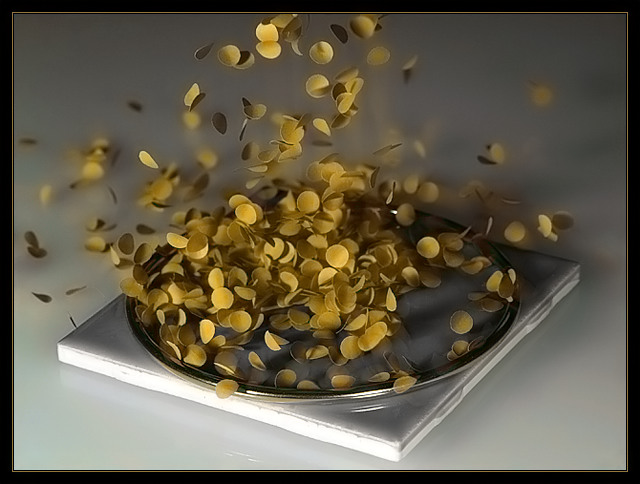
Briefly, the math behind this is:
Given a circle inscribed in a square. If we drop lots of these circles, or dots, or throw a dart as in other experiments, and this is done at random, then every point within the square (which includes the circle) has an equal chance of being landed on by one of the little circles - excluding other forces such as dot interaction, friction, etc.
If the radius of the circle is R, then the area of the circle = Pi R^2 and the area of he square = 4 R^2. If you divide the area of the circle by the area of the square you get Pi/4.
Pi can be estimated as:
Pi = 4 x (dots in the circle) / (dots in the square - including those in the circle)
Statistics
Place: 22 out of 92 Avg (all users): 5.9444 Avg (commenters): 7.1250 Avg (participants): 5.7111 Avg (non-participants): 5.9952 Views since voting: 1040 Views during voting: 509 Votes: 252 Comments: 8 Favorites: 1 (view)
I just love the idea of this, but I'm afraid many people won't immediately get the cleverness of it. I hope for your sake they do a little research into the title and grade it appropriately! Personally I was laughing the moment I saw it.
Well, so far, Montecarlo says Pi = 4, cause there ain't no spots on the tile. Apart from that, this is a good image. Nice lighting. The biggest technical problem is colour bleeding, possibly from using chroma noise reduction? An off-board flash should get this effect without having to push the ISO too high, and a lower ISO won't need so much NR. Focus is a little soft, probably from NR again. Highlight on front of tile is also distracting. Despite all this, it's a nice image, and I'm scoring it well. :)