| Author | Thread |
|
|
06/08/2007 09:16:19 AM |
| Nice composition. I think I would like to see more room at the top of the photo. Also a slight bump in contrast could do a lot for this photo. |
|
 Photographer found comment helpful. Photographer found comment helpful. |
|
|
05/08/2007 06:56:11 AM |
| I like what you're going for here with all the angles and shapes, and this is a good perspective. Focus seems a bit soft though, and would like to see more contrast. |
|
| Photographer found comment helpful. |
|
|
05/05/2007 08:14:13 AM |
| Great lines on this. Architecture is always fun to shoot. Nice geometry here. |
|
| Photographer found comment helpful. |
|
|
05/03/2007 05:35:05 PM |
| It's like an optical illusion. Something with the lines and the angle. Makes me think that Spiderman 3 will be in theaters tomorrow! |
|
| Photographer found comment helpful. |
|
|
05/03/2007 07:02:10 AM |
| This is an excellent perspective shot. The next time there is a perspective or lines challenge I would take what you've learned from this and re-shoot this shot. You will do very well. |
|
| Photographer found comment helpful. |
|
|
05/02/2007 04:28:50 AM |
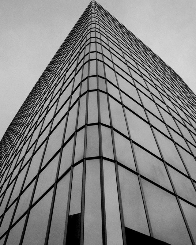
| I think you have a good eye for composition in this photo. The reason is your capture of shapes and how they play out. Love the lines, angle, perspective & shapes. You have the corner of the office building's point touch the top of the rectangular photo - thus cutting the sky portion up into two triangles. I was going to suggest that you could have had the point centered in the center so that you had two symmetrical triangles in the photo but the asymmetrical aspect of this I think is more appealing and adds interest. You have more shapes - the various sized rectangles of the building as they reach up to the vanishing point. A very geometric oriented photo. The thing that the photo suffers from is the lack of contrast in tones. Playing with levels in the color channel mixer or brightness/contrast should make the building pop out more from the gray tones of the sky. |
|
| Photographer found comment helpful. |
|
|
05/02/2007 04:23:21 AM |
Many aspects of this that I really like.
As opposed to some of the other comments I really love the tight crop at the top and there are some wonderful optical illusions going on with the window frames of the building at the side.
Areas which you might want to think about
1. I think the noise in this instance detracts a touch from the shot
2. (And I appreciate other people differ on this) would have preferred a more symettrical rather than slight assymettric crop)
I'd also be interested to see what this looks like with a crop that meant you saw no sky and the building completely filled the frame (though to be honest I am not 100% sure whether this would work)
Overall a nice start |
|
| Photographer found comment helpful. |
|
|
05/02/2007 04:10:08 AM |
| Great lines and perspective here. Grain adds an interesting note. Would like to see a little more negative space at top of photo. |
|
| Photographer found comment helpful. |
|
|
05/02/2007 03:31:59 AM |
I really like the lines and shapes here - especially the slight asymmetry of the picture.
I agree with the comments below about lacking contrast. You could do levels, curves, contrast as suggested below but I'm guessing you destaurated with the destaurate command so I'd suggest using the Channel Mixer, ticking the monochrome box, and playing with the sliders. Aim for a total of roughly 100 percent. Then you can do the other stuff and dodge and burn.
If you knew this already and are sat there thinking 'Who does this freak think he is to try to tell me how to do something that obvious' then just ignore me or PM me to piss off. |
|
| Photographer found comment helpful. |
|
|
05/01/2007 04:32:14 PM |
| Great angle, great perspective and also great leading lines as well..... |
|
| Photographer found comment helpful. |
|
|
05/01/2007 04:18:56 PM |
| I like the angle of the shot but this type of photo can really take advantage of more contrast to emphasize the shapes even more. |
|
| Photographer found comment helpful. |
|
|
05/01/2007 02:39:01 PM |
| I love the angle, but I think this would be uber fantastic if it had a lot more dramatic contrastiness with it. |
|
| Photographer found comment helpful. |
|
|
05/01/2007 02:05:05 PM |
I love this shot - wishing for more contrast.
What does Ursula mean by NI & NN? |
|
| Photographer found comment helpful. |
|
|
05/01/2007 09:50:50 AM |
|
| Photographer found comment helpful. |
|
|
05/01/2007 07:51:24 AM |
| Good angle. I think this is one instance when NI (or NN) would do good. I think the crop is a bit tight at the top, and I wish there were not those dark areas at the bottom. Good greys. |
|
| Photographer found comment helpful. |
|
|
05/01/2007 07:01:05 AM |
| I like the building and the angle you shot it at. I'm not sure if the dark sections at the bottom are distracting or cause the eye to move up into the shot. All I know is that it sure has movement, which is hard to do with a stationary building LOL. |
|
| Photographer found comment helpful. |
|
|
05/01/2007 04:59:48 AM |
| good perspective here and nice tonal B&W well done |
|
| Photographer found comment helpful. |
|
|
04/30/2007 09:04:53 PM |
| I like the angles. This is like one of those pics where the lines start moving if you stare at it too long lol. Of course it is 1AM for me right now... I guess to really make those lines jump out even more, try some more contrast? |
|
| Photographer found comment helpful. |
|
|
04/30/2007 08:47:24 PM |
| Great angle! The funky detail at the top of the building is fun. It's a bit dark. Contrast/Brighten will help with this. Maybe take a little less off the top when ya crop! ;) Great start. |
|
| Photographer found comment helpful. |
|
|
04/30/2007 06:55:39 PM |
| If you don't know what you're doing I need a WHOLE lot of help, lol. this very very cool! Needs more contrast and maybe lightened a bit, maybe just a bit more headroom at the top for my taste but a very cool shot!! |
|
| Photographer found comment helpful. |
|
|
04/30/2007 06:37:55 PM |
| Cool view. I'd have liked it to have more contrast, seems a bit flat. |
|
| Photographer found comment helpful. |
|
|
04/30/2007 06:35:01 PM |
| I like the symmetry. If it were mine, I'd pump up the contrast but I am pretty crazy about WILD high contrast. ;~D |
|
| Photographer found comment helpful. |
|
|
04/30/2007 06:01:39 PM |
| you seem to know wot you're doing re the excellent perspective and the very dramatic angle ... personally i'd like a bit more contrast here ... levels are good for that and also brightness & contrast .. i like using adjustment layers for those sort of 'adjustments' !! .. you can work in them and make 'adjustments' that you couldnt do if you just duplicated the layer .. :) |
|
| Photographer found comment helpful. |
|
|
04/30/2007 05:57:16 PM |
Oh, but I think you DO know what you are doing :) You obviously have quite the eye for strong lines and appealing compositions. It's very bold and urban looking. Can't wait to see more of your stuff :)
|
|
| Photographer found comment helpful. |
|
|
04/30/2007 05:14:08 PM |
| I like the slight assymmetry, adds interest and keeps my eye moving. |
|
| Photographer found comment helpful. |
|
|
04/30/2007 04:24:12 PM |
| Very cool perspective! Seems a bit dull, though, maybe add more contrast. |
|
| Photographer found comment helpful. |
|
|
04/30/2007 04:17:42 PM |
Originally posted by weegi70:
I would darken the blue a bit more, but... it was completely overcast, and not a speck of blue to be found.... |
though luck :d I think you did a great job though. |
|
| Photographer found comment helpful. |
|
|
04/30/2007 04:14:40 PM |
| I would darken the blue a bit more, but... it was completely overcast, and not a speck of blue to be found.... |
|
|
|
04/30/2007 04:11:35 PM |
| try dropping the blue channel a bit more to get a darker sky. |
|
| Photographer found comment helpful. |
|
|
04/30/2007 04:10:24 PM |
|
| Photographer found comment helpful. |
|
|
04/30/2007 04:08:17 PM |
| graphically interesting composition. i like that it's not totally symmetric. |
|
| Photographer found comment helpful. |
Home -
Challenges -
Community -
League -
Photos -
Cameras -
Lenses -
Learn -
Help -
Terms of Use -
Privacy -
Top ^
DPChallenge, and website content and design, Copyright © 2001-2025 Challenging Technologies, LLC.
All digital photo copyrights belong to the photographers and may not be used without permission.
Current Server Time: 04/07/2025 09:33:28 PM EDT.