| Author | Thread |
|
|
05/05/2007 06:03:30 PM |
| In a regular challenge, I can only hear the comments about the over exposure and "blow outs" *grin* BUT......we're here, learning to express ourselves and some of the great shots in advertising have been purposely over exposed and blown out to highlight certain focal points. Love them both actually! |
|
 Photographer found comment helpful. Photographer found comment helpful. |
|
|
05/03/2007 05:33:11 PM |
| I like both pictures for all of the reasons listed below. |
|
| Photographer found comment helpful. |
|
|
05/03/2007 06:53:08 AM |
| The left is my favorite. The angle of the shot gives longer lines on her face which adds to capture her beauty. Very nice! |
|
| Photographer found comment helpful. |
|
|
05/02/2007 04:16:55 AM |
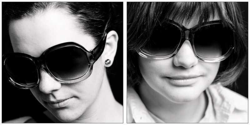
| I don't think the one on the left is over contrasty - on my monitor the B&W tones really pop visually. Normally I like to see portraits that show the eyes, but the one on the left shows personality - the tilt to the head and the impression of giving the viewer a slight stare-down behind those sunglasses gives me the idea of a spunky and very opinionated lady. "Showing" or capturing some personality in a shot is good because it serves to draw a viewer in and hold their interest. The one on the right has good B&W tones but is not in as sharp focus as the left one. The top halve of the face is in focus with sharp details but the lower half seems a tad soft. |
|
| Photographer found comment helpful. |
|
|
05/02/2007 04:09:31 AM |
| Very cool. Like your choice of slight overexposure here - I don't find it too "contrasty". However, the tones don't quite match in the two photos - the right has a slight blue undertone, and the left has a red undertone. Not sure if it was deliberate. If so, I would either emphasize the difference more or try to match them up a bit more. Anyway, excellent submission! |
|
| Photographer found comment helpful. |
|
|
05/01/2007 10:48:32 PM |
| Nice. I like the one on the left, slightly blown, but I like the angle of the jaw and the lighting. The one on the right looks soft. |
|
| Photographer found comment helpful. |
|
|
05/01/2007 09:08:29 PM |
| i like alot of contrast in b&w personally |
|
| Photographer found comment helpful. |
|
|
05/01/2007 04:31:34 PM |
|
| Photographer found comment helpful. |
|
|
05/01/2007 02:38:14 PM |
| Hmm, I think the left is a bit blown out, not too contrasty, as is the right. Not really sure what to say, neither really stirs me one way or another. it also appears to be two different models... which I think it would have been better effect if there was only a single model for both sides in the different look. |
|
| Photographer found comment helpful. |
|
|
05/01/2007 01:56:52 PM |
|
| Photographer found comment helpful. |
|
|
05/01/2007 10:55:43 AM |
Originally posted by ursula:
I prefer the left image. It's not too punchy. The image at the right is a bit soft I think. The tones look different in the two - did you process them together (as a duo), or separatedly? |
I porcessed them spearatedly in lightroom, they are meant to be viewed as to separate shots, just could'nt choose. Maybe I should have increased the contrast on right one for the internet, but then again I like images with low contrast.
oh yeah, they are two different girls
Message edited by author 2007-05-01 14:56:38. |
|
|
|
05/01/2007 09:50:06 AM |
| I also like the one on the left, I think it is the angle that makes it. |
|
| Photographer found comment helpful. |
|
|
05/01/2007 07:50:12 AM |
| I prefer the left image. It's not too punchy. The image at the right is a bit soft I think. The tones look different in the two - did you process them together (as a duo), or separatedly? |
|
| Photographer found comment helpful. |
|
|
05/01/2007 06:58:54 AM |
| Actually, I prefer the left one. Perhaps the angle is much more inviting? |
|
| Photographer found comment helpful. |
|
|
04/30/2007 09:03:03 PM |
| Fun - look at those big glasses. For my taste, I like the one on the left. I like the contrast and the pose. But people are right, this is a fun diptych. |
|
| Photographer found comment helpful. |
|
|
04/30/2007 08:14:56 PM |
| Wonderful contrast! I love the glasses and the expression!! |
|
| Photographer found comment helpful. |
|
|
04/30/2007 08:12:31 PM |
| totally friggin perfect conversion and great contrast. it totally pops out at me. amazingness |
|
| Photographer found comment helpful. |
|
|
04/30/2007 06:51:42 PM |
| Is it "too contrasty" well if taken by itself...maybe, but as a diptyck I see it as (partly because of the different expression as well as the contrast) as being different accpect's of the same person, sort of telling a story. So no in this case I don't think so. Very nice! |
|
| Photographer found comment helpful. |
|
|
04/30/2007 06:37:05 PM |
I like the one on the left - not too contrasty for me and pretty darn cool looking.
The one on the right however - not sure it's very flattering? If it's the same girl, then I'm pleasantly surprised and the photo on the left is a 'makeover'. Still mulling it over... |
|
| Photographer found comment helpful. |
|
|
04/30/2007 06:11:49 PM |
| WOW - nice!!! What a way to kick this off. Great job. |
|
| Photographer found comment helpful. |
|
|
04/30/2007 06:08:07 PM |
| dont decide!!! .. as a diptych it works very well .. i like the sort'v cool expressions, like she's not giving much away ... the sunglasses work very well .. shame the face on the right isnt more in focus ... just my opinion tho ..:) |
|
| Photographer found comment helpful. |
|
|
04/30/2007 05:59:58 PM |
I don't think so! But then, I am in love with high key photos. I can see either one of these elegantly displayed in a great frame on a significant other's chic high rise office desk.
That's what I always do with photos -- imagine a setting where they would just kick-butt :)
|
|
| Photographer found comment helpful. |
|
|
04/30/2007 05:12:25 PM |
| I prefer the left one as well. The highlights and shadows work great for me. |
|
| Photographer found comment helpful. |
|
|
04/30/2007 04:57:16 PM |
|
| Photographer found comment helpful. |
|
|
04/30/2007 04:23:31 PM |
| I actually prefer the left one to the right one. The right one seems too soft. Great job! |
|
| Photographer found comment helpful. |
|
|
04/30/2007 03:51:47 PM |
| i like the one on the left... and the right... two very good photos, makes me wish i had that kind of lighting... all i got is a small-ish reflector... Good Job. |
|
| Photographer found comment helpful. |
|
|
04/30/2007 03:37:37 PM |
Originally posted by MAK:
I like the blown highlights works really well, great set of sunglasses too very 70s 2 good looking models too, no wonder you had troudle deciding. nice that the lighting was corrected in the glasses and done well too. |
I have not "corrected" anything, so I can't take credit for that :D
I just healed out a four or five spots and applied a warming filter in ps. Justa mather of lighting the glasses right(from an angle). :D
Message edited by author 2007-04-30 19:46:33. |
|
|
|
04/30/2007 03:34:32 PM |
| I like the blown highlights works really well, great set of sunglasses too very 70s 2 good looking models too, no wonder you had troudle deciding. nice that the lighting was corrected in the glasses and done well too. |
|
| Photographer found comment helpful. |
|
|
04/30/2007 03:30:17 PM |
i like how you composed this diptych. looks like 2 women with different styles, yet the same style eye glass is their common taste.
Message edited by author 2007-04-30 19:31:25. |
|
| Photographer found comment helpful. |
Home -
Challenges -
Community -
League -
Photos -
Cameras -
Lenses -
Learn -
Help -
Terms of Use -
Privacy -
Top ^
DPChallenge, and website content and design, Copyright © 2001-2025 Challenging Technologies, LLC.
All digital photo copyrights belong to the photographers and may not be used without permission.
Current Server Time: 04/12/2025 04:46:46 AM EDT.