| Author | Thread |
|
|
12/31/2008 01:02:43 PM |
| The contrasts of Architecture and nature beautifully composed. |
|
 Photographer found comment helpful. Photographer found comment helpful. |
|
|
08/19/2007 09:01:27 PM |
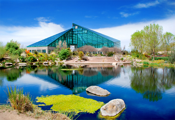
| This really is a nice picture Colleen. The blue is very vibrant, but I don't see it as over saturated at all. Clarity and sharpness are as good as the exposure. I don't see anything not to like! |
|
| Photographer found comment helpful. |
|
|
06/25/2007 03:50:57 PM |
| I love the colors in this, I don't think it's too far at all! looks great! |
|
| Photographer found comment helpful. |
Comments Made During the Challenge  |
|
|
05/06/2007 04:16:24 AM |
| The composition is good but I think you went a little to far on the saturation part. |
|
| Photographer found comment helpful. |
|
|
05/03/2007 08:45:44 AM |
|
| Photographer found comment helpful. |
|
|
05/02/2007 05:01:25 AM |
| love it, looks heavily Pshopped to me but i like it all the same :o) |
|
| Photographer found comment helpful. |
|
|
05/01/2007 11:14:51 AM |
|
| Photographer found comment helpful. |
|
|
05/01/2007 09:51:26 AM |
| This is a very sharp, colorful image, though the ground in the bottom left is distracting. |
|
| Photographer found comment helpful. |
|
|
05/01/2007 06:14:21 AM |
|
| Photographer found comment helpful. |
|
|
05/01/2007 03:56:25 AM |
| Way to much saturation but otherwise great photo |
|
| Photographer found comment helpful. |
|
|
04/30/2007 08:29:01 PM |
| I really like the brilliant blues here but I think that the big patch of dirt on the left breaks up the neon nature of the rest of the picture though and I think it may have been nice to clone over the water from the right to the left |
|
| Photographer found comment helpful. |
Home -
Challenges -
Community -
League -
Photos -
Cameras -
Lenses -
Learn -
Help -
Terms of Use -
Privacy -
Top ^
DPChallenge, and website content and design, Copyright © 2001-2025 Challenging Technologies, LLC.
All digital photo copyrights belong to the photographers and may not be used without permission.
Current Server Time: 04/09/2025 07:44:41 PM EDT.