| Author | Thread |
|
|
05/05/2007 05:54:34 PM |
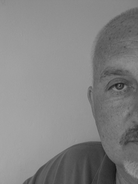
I like the idea that you've hidden half of the model's face and makes you wonder what the other half of him is like. With everyone's facial asymetry, one can only guess and that's part of the mystery, isn't it?
As for the photo itself.....as one struggling with learning myself, I think it might be much stronger if the contrasts in tones of B&W were a bit stronger. |
|
 Photographer found comment helpful. Photographer found comment helpful. |
|
|
05/03/2007 05:22:23 PM |
| I agree with the contrast statement. |
|
| Photographer found comment helpful. |
|
|
05/02/2007 04:26:00 PM |
| With a bit more contrast this would look really good. The good news is that it's easy to fix in post-processing, so you don't have to start from scratch. |
|
| Photographer found comment helpful. |
|
|
05/02/2007 02:09:39 PM |
| I think it's effective when portrait shots are off center like this one, and you captured a nice glint in the eye. Overall the b&w is a bit dull, not a wide range of tone from very black to white and focus on the face should be sharper. |
|
| Photographer found comment helpful. |
|
|
05/02/2007 05:35:35 AM |
| Interesting composition, but like at least one of the previous posters, I would like to see more contrast. |
|
| Photographer found comment helpful. |
|
|
05/02/2007 04:02:42 AM |
| Nice that you tried something different - I'm a fan of the shots with half a face, as it nicely focuses on your eye. Would like to see a bigger tonal range here (full spectrum from black to white). |
|
| Photographer found comment helpful. |
|
|
05/01/2007 09:02:18 PM |
| well at least he'll only feel half as bad about this shot...i like the comp. but wish there was more texture to the skin...thats what i love about b$w shots is the skin |
|
| Photographer found comment helpful. |
|
|
05/01/2007 04:24:53 PM |
| I like the composition, but feel it is just a little to soft for me..... |
|
| Photographer found comment helpful. |
|
|
05/01/2007 02:20:19 PM |
| It is a fantastic shot of your friend, I really enjoy the half capture. But for my preference I would enjoy a bit more contrastiness in the image. It just really seems a bit flat. |
|
| Photographer found comment helpful. |
|
|
05/01/2007 01:35:50 PM |
| I like the pose the expression, I even like the greyness, all excpet the eyeball, because it is staring right at me, I want it brighter. You can cheat on the whites of the eyes, you know. Zoom in on the eye till it is really big, take a small brush, white "paint" and low opacity and flow (maybe 10%) Paint the whites of the eye slightly with white. It helps to make the eyes the focus of the face. |
|
| Photographer found comment helpful. |
|
|
05/01/2007 01:28:26 PM |
| Great idea, I love the composition |
|
| Photographer found comment helpful. |
|
|
05/01/2007 09:35:47 AM |
| I like how you did this shot. I'm not going to comment on post processing because I suck at it. |
|
| Photographer found comment helpful. |
|
|
05/01/2007 07:56:20 AM |
| I like the composition here - not quite half face - looks very angsty and Bergmanesque - i do find it too grey though - maybe converting to mono through the channel mixer and then d&d would help ? |
|
| Photographer found comment helpful. |
|
|
05/01/2007 07:29:40 AM |
He looks like he would make a great model (pity he's shy). I like the shape of the eye, it's rather unique. The lashes go straight down. Great skin texture also (I hate all that skin that looks like plastic, this one doesn't).
As a B/W, I think it needs more "umph", more contrast or something like that. It's a bit bland for a b/w. You have some good suggestions below.
As a composition, it's just way too much dead space. It's an interesting concept, to show half a face, but as it is I don't think it really works well. Again, there are some good suggestions below. |
|
| Photographer found comment helpful. |
|
|
05/01/2007 06:39:02 AM |
| Nice job. I particularly don't do well on portraits. So I'm not sure how much I can add here. The only thing that comes to mind is that it could use a bit more contrast. I think you got his shyness coming thru. |
|
| Photographer found comment helpful. |
|
|
04/30/2007 08:40:50 PM |
| I like the idea here. The contrast may need to be pushed a bit more. Some are purists in that they want complete black and complete white. Being able to do a shot with only gray tones is tougher to do sometimes, but you've done it here. I would say bump up the contrast a bit, then brighten if needed. Nice self-portrait! |
|
| Photographer found comment helpful. |
|
|
04/30/2007 08:09:16 PM |
| really really cool composition!! i like your idea on this. overall its a little bit too grey for me though... perhaps change the way u convert to black and white (dont just go greyscale or desat)... something i finally learned pretty late in the game! |
|
| Photographer found comment helpful. |
|
|
04/30/2007 07:39:19 PM |
| Great idea - makes for an interesting portrait. More contrast - I believe it was mentioned - would add to the photo. |
|
| Photographer found comment helpful. |
|
|
04/30/2007 06:44:19 PM |
| Ha great idea with having him kind of either pop into the frame or getting ready to pop out. I am with the others - I think some more contrast would add some to the pic. |
|
| Photographer found comment helpful. |
|
|
04/30/2007 06:16:48 PM |
| I like the half face portrait. Maybe a touch better in the focusing would really give it the POP it deserves! ;~D |
|
| Photographer found comment helpful. |
|
|
04/30/2007 06:14:38 PM |
I like it too! Usually you see dramatically beautiful women in this 1/2 faced crop. But why not a strong, face full of character! I don't see how he wouldn't like this!
|
|
| Photographer found comment helpful. |
|
|
04/30/2007 04:59:09 PM |
| The contrast needs a little more work to make it pop visually. As it stands now the tonal range is flat with not much tonal difference between the elements in the shot. Playing with curves and/or levels would help make this portrait shot really pop. I like how you composed the shot so that we see only half of the model. It adds interest to the portrait. We look closer at the half of the face we do see to look for personality/characteristics but we wonder about what the other half would show. You could let us see more of the man if you bring us closer to your subject. By that I mean a closer crop - a square crop where his whole face fills up the right half of the crop. As it stands now I think there is too much 'empty' space in the composition that adds nothing to the overall composition. |
|
| Photographer found comment helpful. |
|
|
04/30/2007 04:16:13 PM |
| I like the crop, very nice. Looks like it could use a bit of contrast, seems a bit dull. |
|
| Photographer found comment helpful. |
|
|
04/30/2007 02:26:01 PM |
| interesting composition, i agree that this needs a bit more contrast. |
|
| Photographer found comment helpful. |
|
|
04/30/2007 02:24:16 PM |
| I love the half face image - but the contrast (especially in the eyes) could be boosted to give this a lot more jump - nice start |
|
| Photographer found comment helpful. |
|
|
04/30/2007 02:12:39 PM |
| As has been mentioned, Contrast and I do levels rather than curves most of the time sometimes both, I find it a bit easier to use, JMO. Love the comp. in this though great idea! |
|
| Photographer found comment helpful. |
|
|
04/30/2007 02:02:46 PM |
hi jon .. an unusual and different portrait and i love your composition .. the overall grey and uncontrasty tones doesnt work for me so much .. i also wish his eye was a bit sharper coz its the point of interest ... i've said in my first post, in this b&w challenge, that i want constructive criticism from ppl so i improve, but i feel a bit hesitant to say anything i dont like in someone else's coz i am aware that it's only my opinion ... but i'm gonna try in this challenge to not only say wot i dont like but be very complimentary when i do!!..:)
|
|
| Photographer found comment helpful. |
|
|
04/30/2007 02:02:45 PM |
Hey tell Ev he has a GREAT face for photography - GRIN!
I like this shot too, but not loving the post processing.
Think more contrast would have been lovely, and perhaps a little sharpening.
He has a lovely sparkly eye (hope he has a matching one - SMILE!) |
|
| Photographer found comment helpful. |
|
|
04/30/2007 02:01:35 PM |
| It's a bit bland and the wall is a bit too sharp |
|
| Photographer found comment helpful. |
|
|
04/30/2007 01:58:56 PM |
| not enough tone in my opinion. needs a curves run over it. I love the crop. Play around with the curves and contrast to create more depth in the B&W. |
|
| Photographer found comment helpful. |
Home -
Challenges -
Community -
League -
Photos -
Cameras -
Lenses -
Learn -
Help -
Terms of Use -
Privacy -
Top ^
DPChallenge, and website content and design, Copyright © 2001-2025 Challenging Technologies, LLC.
All digital photo copyrights belong to the photographers and may not be used without permission.
Current Server Time: 04/07/2025 09:22:16 PM EDT.