| Author | Thread |
Comments Made During the Challenge  |
|
|
05/06/2007 07:09:56 PM |
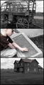
| looks like you're missing a few chunks out of the bottom of the first pic.. too bad, but a great idea anyway :) |
|
|
|
05/05/2007 11:54:56 PM |
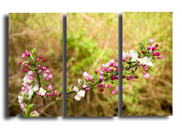
| When splitting a single image up, try to make something interesting happen in each section so it tells a story or makes a comparison or something, as opposed to simply splitting the scene up. |
|
|
|
05/04/2007 04:13:46 AM |
| I wish the bokeh were smoother, but the composition and color are excellent. The triptych treatment is very good (the minor misalignment of the right panel is the only problem) |
|
|
|
05/03/2007 07:11:48 PM |
|
|
|
05/03/2007 01:54:02 PM |
|
|
|
05/01/2007 05:07:48 PM |
| I like how the photos pop off of the white background, but the 3rd one is placed higher, which is confusing. Nice diagonal line that goes through the 3 frames. |
|
|
|
05/01/2007 04:42:05 PM |
| Nice light be the subject is a little low in the frame which leaves a lot of unused areas - Which in a lot of cases is a good thing but not here I am afraid. |
|
|
|
04/30/2007 04:24:04 PM |
| A very creative and delicate presentation. |
|
|
|
04/30/2007 10:40:06 AM |
| To be honest the drop shadow is really distracting and takes away from the overall image |
|
|
|
04/30/2007 05:28:29 AM |
| This is totally my cup of tea. Love the green/ pink theme as well as the dropped shadow. The bokeh is lovely. 8 - and no I do NOT know who took this. |
|
|
|
04/29/2007 10:26:27 PM |
| Pretty, but it looks like a single photo chopped into three parts. |
|
|
|
04/29/2007 08:55:44 PM |
|
Home -
Challenges -
Community -
League -
Photos -
Cameras -
Lenses -
Learn -
Help -
Terms of Use -
Privacy -
Top ^
DPChallenge, and website content and design, Copyright © 2001-2025 Challenging Technologies, LLC.
All digital photo copyrights belong to the photographers and may not be used without permission.
Current Server Time: 04/09/2025 03:11:32 PM EDT.