From the Critique Club
How are you doing today? I am going to touch on a few items with your image.
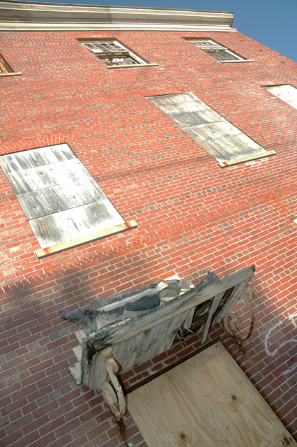
Colour;
Personaly for me the colour seems a bit flat. It could be the combination of the old wood and white matching the grout a bit that gives the flater colour. I think maybe having an older feel to the brick might really enhance the overall colour.
DOF/Focus;
It seems this area is doing really well, everything seems to be in focus and the angle fades off nicely. But, I am wondering though what would happen if you used a more shallow dof, and focused on something more in the 1/3rd spirit.
Post;
simple post was done for the basic challenge, and I am wondering what this may have looked like if you pushed it a bit farther with levels or curves.
Off Items;
The bright spots on the wood covered windows is a major distraction for me, as sis the tiny bit of blue sky in the corner. Also, to me, there is not a clear focal point and it doesn't really tell me the rules of thirds was used.
Other;
I am thinking, what if you cropped it down so the sky is not showing, upped some curves to give a deeper colour to the bricks, and use a shallow dof to really focus in on one aspect of the image in one of the 1/3 quadrants. I think this has a lot of potentional and I do enjoy the angle and such.
Nice Job
Andrew 'littlegett' |