| Author | Thread |
|
|
05/07/2007 04:51:19 AM |
Greetings from the Critique Club -
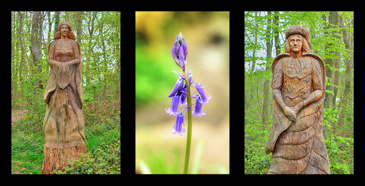
Looks like you had a pleasant walk through the woods. Very cool to have statues like this standing along the paths.
Well - you obviously met the challenge and your layout is good. Nice choice to have the statues on either side kind of like guardians.
The colors on the statue images seem a bit oversaturated and a little too fourescent. Toned down a bit to give more of a natural color I think would have been nicer. I havent really done any HDR work but maybe this is a result from that. The colors on the flower and its background bokeh seem more natural, even though the greens are probably the same as the other images.
I think my biggest issue is with the statues not being symmetrical in the frames. It leaves the overall image feeling a bit unbalanced. The strongest image is the center one. Having the other two be more similar woudl have been better bookends for the flower.
That said - your vote spread is pretty tight. Not a stinker of an image for sure but also not a stunner that would have brought you the higher votes. You have an in general pleasing image here and nothing to be ashamed of. Keep on working at it and the higher scores will come.
Tim
|
|
Comments Made During the Challenge  |
|
|
05/06/2007 09:25:27 AM |
| tells an interesting story, Kinda wish the composition of the two statues were more dynamic, or had the same depth of field the blue bells have. They seem out of place with the flowers. Just a thought. |
|
 Photographer found comment helpful. Photographer found comment helpful. |
|
|
05/03/2007 07:07:04 PM |
|
| Photographer found comment helpful. |
|
|
05/02/2007 02:10:04 AM |
| I like this idea.. very natural feel to it, and I like the variation in the dof with the middle shot. I think this might have been better for me if the two end shots had been more symmetrcal. Perhaps cropping closer on the left one to make the statue the same size as in the right shot. Nice! |
|
| Photographer found comment helpful. |
|
|
05/01/2007 01:10:15 PM |
| love the clarity on the middle shot... nicely done |
|
| Photographer found comment helpful. |
|
|
04/30/2007 08:56:33 PM |
| I like the middle image - Nice set. |
|
| Photographer found comment helpful. |
|
|
04/30/2007 02:36:22 PM |
| I think I would have preferred all images have their background blurred by use of aperature. It's a little overwhelming to the eye to see such extreme differences from one image to the next. IMHO |
|
| Photographer found comment helpful. |
|
|
04/30/2007 08:38:17 AM |
| i think the balance would be improved if both statues were shot at the same focal length, or at least filled their frames equally. otherwise very sharp and nice captures. |
|
| Photographer found comment helpful. |
|
|
04/30/2007 04:11:20 AM |
| The one in the middle is beautiful! |
|
| Photographer found comment helpful. |
Home -
Challenges -
Community -
League -
Photos -
Cameras -
Lenses -
Learn -
Help -
Terms of Use -
Privacy -
Top ^
DPChallenge, and website content and design, Copyright © 2001-2025 Challenging Technologies, LLC.
All digital photo copyrights belong to the photographers and may not be used without permission.
Current Server Time: 04/07/2025 02:01:21 PM EDT.