| Author | Thread |
|
|
05/02/2007 05:02:32 PM |
Hi from the Critique Club,
I see that Steve already gave you a killer critique, so I'll try to limit mine to what he didn't say.
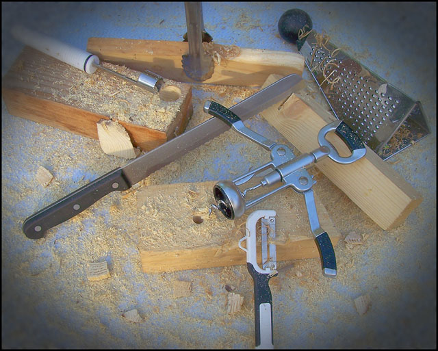
Great job on this shot. It is creative, well exposed, and in focus. I would say that the contrast could be greatly increased, as the black handles are not even close to black (and the eye expects them to be). Some would argue against the vignette, but I find it effective here. Without it, the eye might drift to the edges and expect more (i.e. run off the image and look elsewhere). Perhaps a different perspective (not top-down) would have yielded a higher score.
Much of the grain in the wood could have been emphasized to really strengthen this shot. Also, the shadow on the knife on the back piece of wood (with the tongs on it) is distracting.
Not a bad shot at all, although a few of the improvements from the commenters below would have bumped it into the top 50, if not higher. Obviously you couldn't apply those comments to this image, but they are certainly beneficial for future submissions.
Good job.
Regards,
Geoff Ball |
|
 Photographer found comment helpful. Photographer found comment helpful. |
|
|
05/02/2007 10:29:18 AM |
| Love the twisted use of sharp implements here! Comp almost looks haphazard but actually is very clever. |
|
| Photographer found comment helpful. |
|
|
05/01/2007 09:32:07 AM |
| I liked this I thought the idea was cool. |
|
| Photographer found comment helpful. |
|
|
04/30/2007 04:35:55 PM |
Steve Davidson is right on the money as far as I'm concerned. For the idea, concept and set-up this is worth all the votes in the world, but then it doesn't quite make it as a photograph. I think a darker (and preferably non-reflective?) background might have helped, to set off and contrast with the chrome and stainless steel - where light's reflected off the corkscrew it's the same colour and tone as the background material.
It's too good for 5.6, in many ways, but I can't say it's wrong. Really enjoyed the picture though. |
|
| Photographer found comment helpful. |
|
|
04/30/2007 03:29:32 PM |
| I like the original way of using the kitchenware, and the layout is interesting. It's missing a little pizazz, though. Try bumping up the contrast and the other things that stdavidson suggested. I would've been torn between a 5 and 6, so 5.6 sounds about right. |
|
| Photographer found comment helpful. |
|
|
04/30/2007 12:07:00 PM |
Positives:
Very cleverly conceived idea; unique and fun. Great positioning of kitchenware with respect to its corresponding wood piece and the inclusion of sawdust is a nice touch.
Technicals:
Technicals are not as strong as they might for a composition as clever as this. Overall lighting, contrast and perspective are bland. Color is not bad, per se, but then there is nothing in it that attracts the eye outside the light blue.
The vignetting acts more as a distraction than as a support for the composition.
Sharpness is hard to judge. Though I can see some digitalization creeping in along sharp edges the sawdust itself seems very softly focused. Those two things counteract each other visually.
The Challenge:
This meets the challenge in a highly unique and cleverly conceived way. But the technical treatment is almost as though you expected the idea itself to carry the composition. The technicals held it back, particularly the strong vignette which seems to serve no purpose. Normally titles matter little, but something like "High Fiber Diet" would have helped the viewer to associate the kitchenware to the wood faster. First millisecond impression is that it does not meet the challenge.
Suggestions:
It is a great idea and there is much than can be done to bring all that out. Stronger and more angled lighting with more contrast would add considerable visual interest. Reshooting from a different perspective, perhaps closer to the plane of the table with some light background DOF might be worth consideration.
Dodge and burn on the wood grain to make it stand out more would create additional interest and visual support for your main theme. Proper focus is always a critical element in every photograph. To be honest, I have no idea how to handle it in this composition.
Vignetting
Vignetting generally speaking is a good addition for added visual impact of an image, but not the old fashioned kind we see in portraits from the late 19th and early 20th centuries. Yours has more in common with that than not and it looks unbalanced and offset. You want to back off its opacity. Subtlty is a virtue with vignettes and generally speaking setting the opacity of the layer it is on below 18% is a good idea or and/or widening its feathering. We often see on winning images vignettes that have been added that are subtle in their impact but support the image visually very well. Somtimes we see in those images that the photographer has made "hand" changes to the vignette specific to the image. All that you might consider for your own image. |
|
| Photographer found comment helpful. |
|
|
04/30/2007 11:32:31 AM |
|
| Photographer found comment helpful. |
|
|
04/30/2007 10:48:04 AM |
| I thought this one would place a bit higher - very creative! |
|
| Photographer found comment helpful. |
|
|
04/30/2007 09:51:31 AM |
| Very clever use of kitchen utensils! Now can you use woodworking tools in the kitchen as well? |
|
| Photographer found comment helpful. |
|
|
04/30/2007 09:32:56 AM |
| cool shot but your wife is going to kill you for doing that to her kitchenwares |
|
| Photographer found comment helpful. |
|
|
04/30/2007 09:27:10 AM |
| I thought this was very funny and creative - gave it a 7. I just would have liked a little more contrast and a little better lighting. In addition, I wasn't a big fan of the vignetting. |
|
| Photographer found comment helpful. |
|
|
04/30/2007 08:59:01 AM |
| This is such a creative take on the challenge and nicely composed. Even like the vignette! An underrated shot. |
|
| Photographer found comment helpful. |
|
|
04/30/2007 07:59:16 AM |
| lol when I saw this during the challenge, I thought - "what woman let this happen to her kitchen items?" Cute idea, great layout, should have scored above 6. |
|
| Photographer found comment helpful. |
|
|
04/30/2007 06:01:26 AM |
| 5.5? What? I gave you a 10. I thought this was a top finisher! Great take on the challenge. Very creative! |
|
| Photographer found comment helpful. |
Comments Made During the Challenge  |
|
|
04/25/2007 02:04:15 AM |
| mmmmmmm...tasty and lots of fiber too |
|
| Photographer found comment helpful. |
|
|
04/24/2007 11:29:31 PM |
|
| Photographer found comment helpful. |
|
|
04/24/2007 08:16:10 PM |
|
| Photographer found comment helpful. |
|
|
04/24/2007 03:55:25 PM |
|
| Photographer found comment helpful. |
|
|
04/24/2007 02:14:17 PM |
| Interesting concept, well devised with the cuts in the wood, not crazy about the composition, but thats purely opinion. |
|
| Photographer found comment helpful. |
|
|
04/24/2007 01:25:17 PM |
| Nice detail. Definitely an interesting idea. |
|
| Photographer found comment helpful. |
|
|
04/24/2007 12:20:36 PM |
| great imagination of alternate use! well done |
|
| Photographer found comment helpful. |
|
|
04/23/2007 01:50:13 PM |
| very creative mind you have! |
|
| Photographer found comment helpful. |
|
|
04/23/2007 09:20:44 AM |
|
| Photographer found comment helpful. |
|
|
04/23/2007 02:38:55 AM |
| the fakey vignetting takes away from what i think is a really cool idea, where each tool has done something somehow inappropriate to a piece of wood... i'm also not a fan of the blue surface against the yellowish wood -- the colors don't go well together. |
|
| Photographer found comment helpful. |
Home -
Challenges -
Community -
League -
Photos -
Cameras -
Lenses -
Learn -
Help -
Terms of Use -
Privacy -
Top ^
DPChallenge, and website content and design, Copyright © 2001-2026 Challenging Technologies, LLC.
All digital photo copyrights belong to the photographers and may not be used without permission.
Current Server Time: 02/01/2026 05:35:12 AM EST.