| Author | Thread |
Comments Made During the Challenge  |
|
|
05/01/2007 05:32:42 PM |
|
 Photographer found comment helpful. Photographer found comment helpful. |
|
|
04/30/2007 06:32:24 PM |
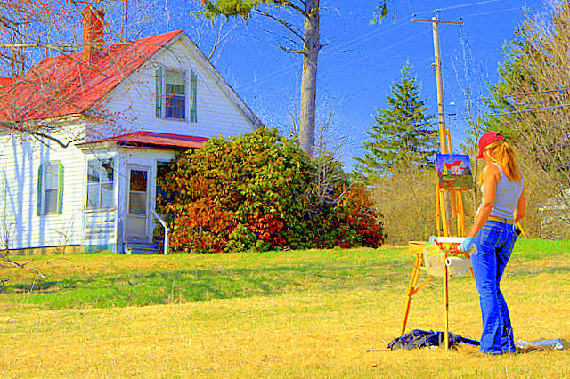
| Looks like the photo was over colored |
|
| Photographer found comment helpful. |
|
|
04/30/2007 03:34:28 PM |
| Beauty post process. I like this concept. Great job. |
|
| Photographer found comment helpful. |
|
|
04/30/2007 10:02:41 AM |
| wow, oversaturated. May be dq'd if thats a filter. |
|
| Photographer found comment helpful. |
|
|
04/30/2007 03:24:22 AM |
| Sorry but the extreme oversaturation of this shot led me to click that "2" button, for me the shot is ruined and only reason I didn´t give a 1 is that it meets the challenge. No offense intended, just thought you at least deserved to know why I scored that way. |
|
| Photographer found comment helpful. |
|
|
04/29/2007 03:35:24 PM |
| The colors are way too oversaturated for my taste. |
|
| Photographer found comment helpful. |
|
|
04/29/2007 12:20:13 PM |
| I wouldnt normally like this kind of preocessing but I think it really works here. |
|
| Photographer found comment helpful. |
|
|
04/28/2007 12:49:35 AM |
| good composition and colours, perhaps too bright. 6 |
|
| Photographer found comment helpful. |
|
|
04/27/2007 10:54:35 AM |
| I like the grainy feel to this and the colors. Looks like a painting, which ties in nicely with the subject. |
|
| Photographer found comment helpful. |
|
|
04/26/2007 06:50:50 PM |
| I'm not a big of a fan of the processing. The telephone phone is really in the way. |
|
| Photographer found comment helpful. |
|
|
04/26/2007 02:02:56 PM |
| Looks very oversaturated on my monitor. |
|
| Photographer found comment helpful. |
|
|
04/26/2007 08:59:56 AM |
| looks like the contrast was messed with in this one, and its now a bit too bright or something.... but i like the idea.... |
|
| Photographer found comment helpful. |
|
|
04/25/2007 09:47:38 PM |
| a little washed out, but follows theme and it's interesting |
|
| Photographer found comment helpful. |
|
|
04/25/2007 06:52:39 PM |
| This would be a great shot - but it looks SOOO over processed. That may have been your intention, but IMHO it would be really nice in a "straight out of the camera" feel. It looks like, since she's painting, you want to make this look like a painting. Not a bad job - but just not my cup of tea. An 8 anyway for a really good effort. Don't let my opinion discourage you! It's good stuff!! :) |
|
| Photographer found comment helpful. |
|
|
04/25/2007 01:22:24 PM |
| I think you brightened the contrest WAY to much. |
|
| Photographer found comment helpful. |
|
|
04/25/2007 08:26:01 AM |
| Cool kinda highly saturated but maybe its to give the photo a more painted look? |
|
| Photographer found comment helpful. |
|
|
04/25/2007 05:56:47 AM |
| This has a very unnatural feel to it, with the shadows being unnaturally highlighted, and the colors unnaturally saturated, I'm afraid. |
|
| Photographer found comment helpful. |
|
|
04/24/2007 09:31:53 PM |
|
| Photographer found comment helpful. |
|
|
04/24/2007 09:31:07 PM |
| The colors are totally exagerated and unnatural. Perhaps that was your intent, but it doesn't work for me. |
|
| Photographer found comment helpful. |
|
|
04/24/2007 08:08:33 PM |
| Far too saturated and sharpened. Plus her composition is more interesting than yours. |
|
| Photographer found comment helpful. |
Home -
Challenges -
Community -
League -
Photos -
Cameras -
Lenses -
Learn -
Help -
Terms of Use -
Privacy -
Top ^
DPChallenge, and website content and design, Copyright © 2001-2025 Challenging Technologies, LLC.
All digital photo copyrights belong to the photographers and may not be used without permission.
Current Server Time: 04/07/2025 01:14:48 AM EDT.