| Author | Thread |
Comments Made During the Challenge  |
|
|
04/29/2007 03:09:03 AM |
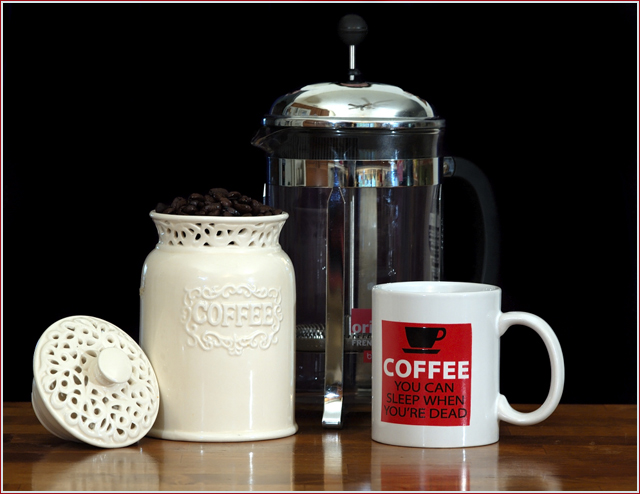
| The coffee cup it disturbing by its color... off white with black lettering would have been a lot better.. |
|
 Photographer found comment helpful. Photographer found comment helpful. |
|
|
04/27/2007 04:14:26 AM |
| Cute still life. Just wish the coffee beans and knob on the press were seperated from the background a bit more. |
|
| Photographer found comment helpful. |
|
|
04/26/2007 04:11:17 PM |
I can't argue with a picture of one of my favorite subjects...The big stuff is all pretty well done. The image is properly exposed, in focus, although it could be sharpened better, and the composition is well balanced. Where it's going to lose points is on the details. A black background is probably not the best choice to back up the coffee beans or the black parts of the coffeepot, because they fade into the background. The rest of the room is reflected off the metal parts of the coffeepot. The last thing is that the glass coffeepot can be lit better to show off the glass (get a copy of Light, Science and Magic from the library, and read the glass chapter). These are all little things, but together, they'll take at least a full point off your final score.
Wow, I really got wordy. Sorry about that. |
|
| Photographer found comment helpful. |
|
|
04/23/2007 12:32:51 PM |
| nice simple and clear presentation |
|
| Photographer found comment helpful. |
|
|
04/22/2007 11:05:46 PM |
| composition is weighted too heavily toward the left, i think. also, boo on words -- they diffuse any subtext the image might have had. if you're going for the "sleep is for the weak" theme, there are more metaphoric ways of going about it (but then again, they probably wouldn't have fit with the challenge theme). |
|
| Photographer found comment helpful. |
Home -
Challenges -
Community -
League -
Photos -
Cameras -
Lenses -
Learn -
Help -
Terms of Use -
Privacy -
Top ^
DPChallenge, and website content and design, Copyright © 2001-2025 Challenging Technologies, LLC.
All digital photo copyrights belong to the photographers and may not be used without permission.
Current Server Time: 04/07/2025 01:52:38 PM EDT.