| Author | Thread |
|
|
05/05/2007 05:23:39 PM |
| Really nice photo...a very belated congratulations to you on your yellow ribbon! |
|
 Photographer found comment helpful. Photographer found comment helpful. |
|
|
05/04/2007 10:29:34 AM |
Nice job Congrats on the award. My bannana slasher only got a 5.3 :( Yours is better though.
 |
|
| Photographer found comment helpful. |
|
|
05/04/2007 02:25:13 AM |
| WOW, T! Another ribbon?!? I'm just checking in to dpc now quickly after a pretty long absence. You are doing so well. Congrats and keep it up! |
|
| Photographer found comment helpful. |
|
|
05/04/2007 02:02:04 AM |
Originally posted by karmat:
CRITIQUE CLUB CRITIQUE
by karmat
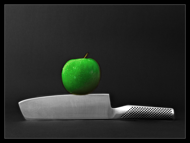
It is truly difficult to "critique" a ribbon winner without sounding like I am just searching for things to complain about.
So, I'll tell you what I think works in this shot, and what was appealing, and what I *personally* think could be "improved" upon.
Technically, you have nailed it. The lighting on this is consistent and even. This allows for details to show throughout the shot. It also makes for a very clean, well focused shot. The slight shadowing on the apple also gives just a touch of depth, otherwise the shot might appear to be a bit flat. The focus is good and the water on the apple gives it a nice touch.
Compositionally, to me, it is static. To have the knife straight through the shot, gives it kind of a "ho-hum" feeling. Granted, the knife is in the lower third of the picture, and that gives it a sense of strength, and the apple is just off of center, so that helps to counter the "static" feeling, but it doesn't add any real interest to the shot.
I think technically, you have done a very good job, and the voters rewarded you handsomely for that. Congratulations! This would be an excellent stock type shot as well.
karmat |
Thanks karmat for your critique, I really appreciate it! That's why I'm here on DPC; to learn and to improve. I have never ever taken picures like this before (just 'holiday pictures' :) and I'm very much a beginner in Photoshop, so have a lot to learn!! |
|
|
|
05/03/2007 06:15:01 PM |
CRITIQUE CLUB CRITIQUE
by karmat
It is truly difficult to "critique" a ribbon winner without sounding like I am just searching for things to complain about.
So, I'll tell you what I think works in this shot, and what was appealing, and what I *personally* think could be "improved" upon.
Technically, you have nailed it. The lighting on this is consistent and even. This allows for details to show throughout the shot. It also makes for a very clean, well focused shot. The slight shadowing on the apple also gives just a touch of depth, otherwise the shot might appear to be a bit flat. The focus is good and the water on the apple gives it a nice touch.
Compositionally, to me, it is static. To have the knife straight through the shot, gives it kind of a "ho-hum" feeling. Granted, the knife is in the lower third of the picture, and that gives it a sense of strength, and the apple is just off of center, so that helps to counter the "static" feeling, but it doesn't add any real interest to the shot.
I think technically, you have done a very good job, and the voters rewarded you handsomely for that. Congratulations! This would be an excellent stock type shot as well.
karmat |
|
| Photographer found comment helpful. |
|
|
05/03/2007 03:34:22 AM |
Originally posted by splidge:
Congratulations on your joint third finish, hopefully your ribbon is in the post...
Is that a Global knife by any chance? :)
splidge |
Yes it's a Global knife :-) I don't have one my self (yet...), I borrowed it from a friend for the challenge. |
|
|
|
05/03/2007 03:32:04 AM |
Originally posted by Artyste:
Might want to go in at 200 - 300% and clean up your edge editing in the future. (Not that it'd be noticeable on *most* monitors I think, but it's clearly visible on mine.) Some strange effects around the edges of the apple and top of the knife (and some on the handle).
Just for future reference anyway. Just pointing out what I see. |
Thanks! I'm really a beginner (and about to discover the techniques with Photoshop...) and appreciate all comments and critiques! |
|
|
|
05/03/2007 01:07:09 AM |
| Hurray for your joint ribbon... |
|
| Photographer found comment helpful. |
|
|
05/02/2007 05:15:39 PM |
Might want to go in at 200 - 300% and clean up your edge editing in the future. (Not that it'd be noticeable on *most* monitors I think, but it's clearly visible on mine.) Some strange effects around the edges of the apple and top of the knife (and some on the handle).
Just for future reference anyway. Just pointing out what I see. |
|
| Photographer found comment helpful. |
|
|
05/02/2007 11:12:03 AM |
Congratulations on your joint third finish, hopefully your ribbon is in the post...
Is that a Global knife by any chance? :)
splidge
Message edited by author 2007-05-02 11:12:33. |
|
| Photographer found comment helpful. |
|
|
05/02/2007 01:19:59 AM |
Originally posted by ludde:
Hehe, sverige är på g nu ;) Grattis till 4:e platsen :) |
Tack! Kul att se fler från 'Svedala' här. Lycka till på DPC!! |
|
|
|
04/30/2007 11:52:40 PM |
| Most impressive visual accent and stylish good use of desat to bring home the point. Congratulations on your top Five finish. |
|
| Photographer found comment helpful. |
|
|
04/30/2007 11:35:14 AM |
| Great shot. I had this picked to be #1 |
|
| Photographer found comment helpful. |
|
|
04/30/2007 06:10:24 AM |
| Hehe, sverige är på g nu ;) Grattis till 4:e platsen :) |
|
| Photographer found comment helpful. |
|
|
04/30/2007 03:27:28 AM |
| I love this shot, everything about it! Huge congrats on 4th place. |
|
| Photographer found comment helpful. |
Comments Made During the Challenge  |
|
|
04/29/2007 11:25:49 PM |
| i start these kinda of critiques out by saying.. in MY opinion.. the apple is overprocessed and totally ruined a BRILLIANT shot! still gets a 6 |
|
| Photographer found comment helpful. |
|
|
04/29/2007 10:15:53 PM |
| this is my top ten....simple |
|
| Photographer found comment helpful. |
|
|
04/29/2007 04:55:38 PM |
| Nice simple composition and the color on the apple really stands out. Nicely done. |
|
| Photographer found comment helpful. |
|
|
04/29/2007 10:47:06 AM |
| Nice spare and interesting shot, but - yes how ironic to say this - perhaps a bit oversharpened. :) There seems just too pronounced an edge around the apple for it to be natural. Maybe it's my monitor - one of the better shots though, I gave it an 8. |
|
| Photographer found comment helpful. |
|
|
04/29/2007 06:57:23 AM |
|
| Photographer found comment helpful. |
|
|
04/28/2007 09:20:50 PM |
|
| Photographer found comment helpful. |
|
|
04/27/2007 03:09:49 PM |
| Nice composition and good choice for selective desat. Apple is just a hair soft around the edges, but still very nice. 7 |
|
| Photographer found comment helpful. |
|
|
04/25/2007 06:01:16 PM |
wow how much did you saturate the apple?
Might have worked even more with a complementary background e.g. purple |
|
| Photographer found comment helpful. |
|
|
04/24/2007 06:51:38 PM |
You stole Magritte's apple and now it looks like you're torturing it.
4 for luscious apple
+ 0 for meaning
+ 1 for passable but not exciting composition
= 5
Normally I wouldn't bother you but I think this might ribbon so I wanted to get my ribbon ribbing in now! ;P |
|
| Photographer found comment helpful. |
|
|
04/24/2007 03:35:13 PM |
| Intersting take. Love the color of the apple. Seems to be a bit fuzzy overall, however. Good job. |
|
| Photographer found comment helpful. |
|
|
04/24/2007 02:24:46 PM |
|
| Photographer found comment helpful. |
|
|
04/24/2007 12:55:55 PM |
|
| Photographer found comment helpful. |
|
|
04/23/2007 09:15:45 PM |
| Love the textures and patterns plus the nice contrasting background. |
|
| Photographer found comment helpful. |
|
|
04/23/2007 07:28:32 PM |
| oooh. nice. The one thing I see is the right edge of the apple seems blurred . Nice, effective shot though! |
|
| Photographer found comment helpful. |
|
|
04/23/2007 06:38:42 PM |
| Nice image, and one of the few that had food in it that was more about the kitchenware than the food. |
|
| Photographer found comment helpful. |
|
|
04/23/2007 01:40:58 PM |
| Excellent photo. The color and the water drops make it really pop out at the viewer. |
|
| Photographer found comment helpful. |
|
|
04/23/2007 11:55:22 AM |
| really nice composition and lighting. the two things that bother me are the black halos around the knife and apple (probably from unsharp mask) and the fact that the apple is the only thing with any color, which makes it look composited or fake somehow to me... i wish the knife had a bit of color in it -- especially a hint of green to show that the apple really is sitting on it. |
|
| Photographer found comment helpful. |
|
|
04/23/2007 09:17:19 AM |
| Excellent clarity and crispness on this image - the lighting is really solid and the composition is very nice - almost wish the apple was a little more to the left |
|
| Photographer found comment helpful. |
|
|
04/23/2007 09:06:58 AM |
| Nice composition and use of minimul color. 9 |
|
| Photographer found comment helpful. |
|
|
04/23/2007 03:45:01 AM |
| well composed. green looks too unnatural. slight glow around the knife distracts. |
|
| Photographer found comment helpful. |
|
|
04/23/2007 12:06:19 AM |
| LOVE the colors!! very nice, 9 |
|
| Photographer found comment helpful. |
Home -
Challenges -
Community -
League -
Photos -
Cameras -
Lenses -
Learn -
Help -
Terms of Use -
Privacy -
Top ^
DPChallenge, and website content and design, Copyright © 2001-2026 Challenging Technologies, LLC.
All digital photo copyrights belong to the photographers and may not be used without permission.
Current Server Time: 02/01/2026 12:00:01 PM EST.


 On The Edge


