DPChallenge: A Digital Photography Contest You are not logged in. (log in or register
 
Challenge Entries
Portfolio Images
This image is not part of a public portfolio.
Nautical Directions
Nautical Directions
Someamateur


Photograph Information Photographer's Comments
Challenge: Free Study 2007-04 (Expert Editing*)
Camera: Pentax *ist DL
Lens: Sigma 18-50mm f/3.5-5.6 DC for Sigma
Location: Brighton Beach, South Australia
Date: Apr 21, 2007
Aperture: 22.0
ISO: 200
Shutter: 1/100
Galleries: Landscape, Action
Date Uploaded: Apr 21, 2007

N/A

Statistics
Place: 529 out of 573
Avg (all users): 4.7560
Avg (commenters): 5.5000
Avg (participants): 4.7083
Avg (non-participants): 4.8750
Views since voting: 642
Views during voting: 237
Votes: 168
Comments: 4
Favorites: 0


Please log in or register to add your comments!

AuthorThread
05/10/2007 03:04:50 PM
Greetings from the Critique Club

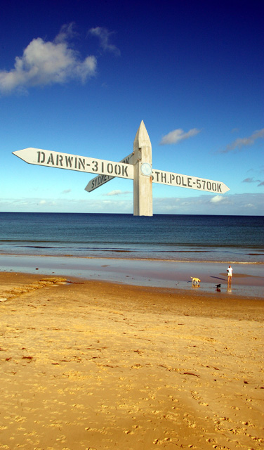
A directional sign out in the ocean is a promising idea that could result in an interesting surreal image. But here, although technically well done, the sign is just so large in proportion to the rest of the photo that it looks like what it is: a photo of a sign pasted on an ocean scene. To me, anyway, it doesn't really convey any special meaning.

Even without that issue, the composition is rather weak. The nearly centered horizon line is rather boring, and the large expanse of beach in the foreground is rather distracting from the idea here. I suggest cropping off the bottom third, putting the horizon on a "rule-of-thirds" line and focusing the viewer's attention more on the sea. The sky isn't bad, but it would be nicer if the clouds were brighter. And I think that this might work better in a horizontal format.

Overall, a worthy experiment for an Expert Editing Free Study. It's not really ribbon quality, but it does certainly show off your creativity, which is a big part of the appeal of DPChallenge.
  Photographer found comment helpful.
 Comments Made During the Challenge
05/06/2007 10:44:39 AM
Nice idea but not one of my faves. The gradient in the sky is a little plasticky.
  Photographer found comment helpful.
05/02/2007 04:42:13 PM
A very nicely capture beach scene. Though the stake looks unnaturely pasted in and out of place. The idea is very interesting, just wondering if there was some other way to implement it in the image.
  Photographer found comment helpful.
05/01/2007 11:28:29 AM
5
  Photographer found comment helpful.


Home - Challenges - Community - League - Photos - Cameras - Lenses - Learn - Help - Terms of Use - Privacy - Top ^
DPChallenge, and website content and design, Copyright © 2001-2025 Challenging Technologies, LLC.
All digital photo copyrights belong to the photographers and may not be used without permission.
Current Server Time: 04/07/2025 02:20:51 AM EDT.