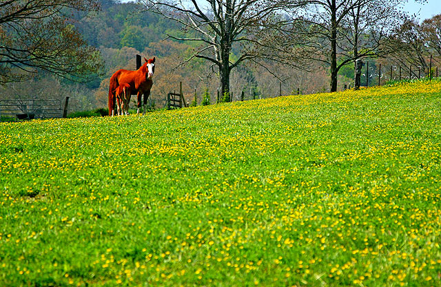
A beautiful spring day in Knoxville. I gave this shot a hefty boost of the following: saturation 50%, brightness 25%, contrast 35%, sharpening, crop from bottom and right side, resized and saved for web and one last sharpening of the smaller image; hand held with Canon 24-105 L IS at 105 mm
Statistics
Place: 167 out of 380 Avg (all users): 5.6566 Avg (commenters): 5.6000 Avg (participants): 5.8356 Avg (non-participants): 5.5161 Views since voting: 695 Views during voting: 202 Votes: 166 Comments: 7 Favorites: 0
Compositionally, you have met the challenge well and used the rule of thirds to effectively set up a nice shot. Normally, I'm not a fan of huge foregrounds, but it seems to work in this shot as it gives the context of the surroundings for the horses. If the sky was a nice blue (I can't tell, but it looks just barely blue), it might have worked better to have the horse in the lower part of the picture, rather than the upper. However, if the sky was more washed out, you've probably made the right decision.
Technically, the focus, exposure and everything seems okay. Your saturation boost seems to have created an "edge" to everything that kind of gives it a grainy feeling. For me, the saturation is a bit over the edge because the horse looks really unnatural. However, reading your title, I'm wondering if you were going for the magical "Wizard of Oz" kind of fantasy feeling. If so, it works, I just hope the viewers "caught" it.
Overall, nicely done.
Karma
PS -- Just read your comments. Yay, I got what you meant. And you didn't get any ones or twos, that in itself is a feat. Good work!
Thanks for comments on my photo. I wanted everything to be oversaturated, to give perhaps a fairytale feel, including the horses which is why I called this Once Upon A Time. I am happy that for this one I received no 1s or 2s, yay. :)
it may be just me, but the horses ( <-- too much red) seem a bit oversaturated, maybe a little less of the foreground flowers next time will bring out the subject a little more, otherwise a nice shot