| Author | Thread |
Comments Made During the Challenge  |
|
|
04/24/2007 07:43:58 PM |
|
 Photographer found comment helpful. Photographer found comment helpful. |
|
|
04/24/2007 07:51:48 AM |
| Nice shot enough but I personally feel this image lacks a main subject, there is nothing that really stands out as very interesting in it. |
|
| Photographer found comment helpful. |
|
|
04/23/2007 11:48:42 PM |
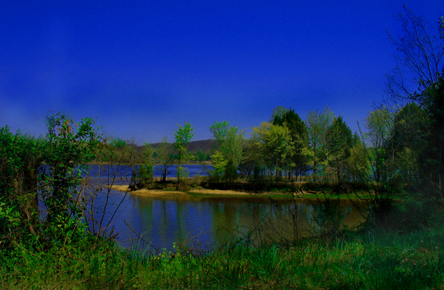
| Pretty, and nicely composed. Just that LITTLE bit oversaturated, in my opinion. 6 |
|
| Photographer found comment helpful. |
|
|
04/23/2007 09:54:41 AM |
|
| Photographer found comment helpful. |
|
|
04/22/2007 04:09:43 PM |
|
| Photographer found comment helpful. |
|
|
04/22/2007 12:51:59 PM |
|
| Photographer found comment helpful. |
|
|
04/22/2007 12:32:07 PM |
| Colors looks somewhat artificial. Not sure what's going on. Trying HD - if so...keep it up. :) |
|
| Photographer found comment helpful. |
|
|
04/22/2007 11:50:42 AM |
|
| Photographer found comment helpful. |
|
|
04/21/2007 09:56:42 PM |
| it looks like some hues were shifted. i'm not sure I like the effect. 5 |
|
| Photographer found comment helpful. |
|
|
04/21/2007 04:51:06 PM |
| you should add some more blue. This will really give this photo the blues. 1 |
|
| Photographer found comment helpful. |
|
|
04/21/2007 10:57:34 AM |
| Sorry, too much green and blue for my taste. Composition is very good. |
|
| Photographer found comment helpful. |
|
|
04/19/2007 01:59:42 PM |
| Very vibrant in color, needs a stronger focal point...6 |
|
| Photographer found comment helpful. |
|
|
04/18/2007 05:06:46 PM |
| No THAT's some serious blue! A little to intense for me. |
|
| Photographer found comment helpful. |
|
|
04/18/2007 03:47:11 PM |
| Completely over saturated. |
|
| Photographer found comment helpful. |
|
|
04/18/2007 03:01:47 PM |
| Seems way too oversaturated on my screen. |
|
| Photographer found comment helpful. |
|
|
04/18/2007 12:13:45 PM |
|
| Photographer found comment helpful. |
|
|
04/18/2007 12:00:13 PM |
| Green and blue are overexpressed and look cartoonish. |
|
| Photographer found comment helpful. |
|
|
04/18/2007 02:46:47 AM |
| Great photo, but too dark. 6, but could have been 7. |
|
| Photographer found comment helpful. |
|
|
04/18/2007 01:56:08 AM |
| hmmm the colors seem very strong, and the focus is off a bit, good composition tho, good lines |
|
| Photographer found comment helpful. |
|
|
04/18/2007 01:47:13 AM |
| Pretty colors, but I think it would look better with a little less saturation. |
|
| Photographer found comment helpful. |
Home -
Challenges -
Community -
League -
Photos -
Cameras -
Lenses -
Learn -
Help -
Terms of Use -
Privacy -
Top ^
DPChallenge, and website content and design, Copyright © 2001-2026 Challenging Technologies, LLC.
All digital photo copyrights belong to the photographers and may not be used without permission.
Current Server Time: 02/01/2026 10:22:16 AM EST.