| Author | Thread |
|
|
05/01/2007 09:40:32 AM |
Positives:
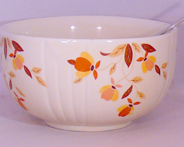
Patterns and browns on the bowl are the strength of the composition.
Technicals:
This is gonna be harsh. I\'m sorry. It is the hardest full critique I\'ve ever written at DPC.
Technically speaking this is a poor quality image. The framing with the bowl being cut off on the left side is wrong. It has excessive color noise. The lighting leaves distracting shadows and overexposed spots on the bowl. The content and composition are not well conceived for a viewer unfamiliar with its sentimental value to you personally. Looks like there is a single and harsh lighting source that produces distracting reflections in the bowl, your main subject. Sharpness is a bit soft. Perspective is snapshot like.
The Challenge:
Meets the challenge, there is no issue with that. A score of 4.1 means the group felt it was below average. I will be honest and up front. I probably would have rated it lower than the group which is unusual for me to do.
It is likely voters thought your image was just a snapshot.
Technical quality and \"wow\" factor are important criteria for DPC voters to give an image a higher score. They are used to seeing very high quality images. I\'m worse. I tend to be harsher in my assessments of images with poorer technical and esthetic quality than the group.
Suggestions:
Obviously, there are some things that could be done to impove this image. Taking it angled with a different perspective is the first thing. Do something to produce a more diffuse lighting using indirect lighting through a windw and avoid using lamps and indoor lighting.
Noise reduction is needed. There is a free version of a program called NeatImage that could help you correct that, but requires you to download and learn to use it.
There are things you could do with post processing as well, but that depends on a lot of things like the type of software you use and basic knowledge and stuff like that. I will be willing to discuss these privately with you if you would like.
You can do better if you want
I reviewed your camera, the Panasonic Lumix DMC-FZ50. It is not used much at DPC but not because it is not a good camera. It has a lot of capability and you can capture high quality DPC worthy images with it if you work at it. You could beat out the best images so far submitted using it and be #1 if you want to try.
If you want to take \'better\' pictures you need a mentor. There are a lot of very, very good photographers at this site and they are surprisingly approachable and helpful if you only ask. |
|
Comments Made During the Challenge  |
|
|
04/29/2007 05:39:06 PM |
| I have custard cups like this. They were my mom's. |
|
|
|
04/28/2007 05:27:16 AM |
Why have the spoon handle in the shot if it's about the bowel?
5
Jack |
|
|
|
04/27/2007 06:20:00 AM |
| Somehow, I think, in an advanced editing challenge, you could have done some post processing to make this Memorable bowl more memorable. |
|
|
|
04/26/2007 04:16:52 PM |
| OK, I dont want to be too negative, but this is a still life, not a moving subject, yet still you managed to cut off the left side of the bowl a fraction, and the spoon/fork in the bowl. The lighting is very flat as well.. next time, try getting an interesting angle on the shot. a face on shot of a bowl is never going to impress anyone.. are you 100% happy with this shot? no, didnt think so. keep trying though. |
|
|
|
04/25/2007 09:16:08 AM |
| was this done with a cell phone? |
|
|
|
04/24/2007 05:10:26 AM |
|
|
|
04/24/2007 03:32:02 AM |
|
|
|
04/23/2007 01:27:56 PM |
| It seems a bit grainy, and the crop is off, in my opinion. I like the bowl though. |
|
|
|
04/23/2007 04:08:14 AM |
| A few problems here that prevent me from giving a high mark: there is considerable digital noise - this may be a side-effect of using a very high ISO, or more likely, of trying to rescue a badly under-exposed photo using photo editing software. Experimant with your camera to work out how high you can go with the film speed before visible 'noise' starts becoming apparant. secondly, the framing is weak - the bowl is tight up against the left hand side, and appears to be cut off just before the edge, whilst there is some space to the right; thirdly, the composition and subject matter do not make for a memorable photograph - at the end of the day the bowl might have some intrinsic value to the owner, but to the viewer this isn't clear - it needs some context in the composition to make sense. |
|
|
|
04/22/2007 08:12:46 PM |
| The whitebalance looks off, pink tint. |
|