| Author | Thread |
|
|
12/19/2003 09:41:59 AM |
From the Critique Club
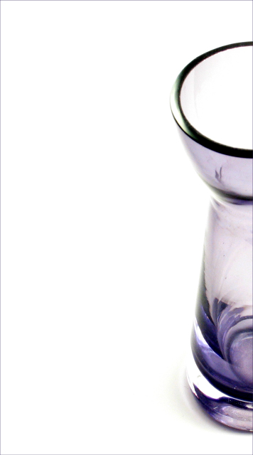
Things I like: I love the (positive feel of the) use of negative space here! I love the simplicity of the composition. I like the cool tones of the subject itself. I like many of the compositional elements of the shot.
Things I don't like: There are some strange lines in the vase itself that I think kind of detract from the otherwise simple feel of this shot. I think (but have never tried to shoot this type of subject) that if you chose an ever so slightly different angle that these would go away or become more interesting (one or the other.) This subject doesn't hold a great deal of interest for me so while I find it a very cool subject for study (I'm gonna try and find a similar object to study myself...), it doesn't really have staying power IMHO.
TC |
|
 Photographer found comment helpful. Photographer found comment helpful. |
Comments Made During the Challenge  |
|
|
12/13/2003 07:07:15 PM |
| excellent cropping/composition 9 |
|
| Photographer found comment helpful. |
|
|
12/13/2003 03:57:51 PM |
| I love the way you've framed this, and the colours are terrific. |
|
| Photographer found comment helpful. |
|
|
12/11/2003 09:53:07 AM |
| I like this crop very much. Good toning, too. A little soft, though. |
|
| Photographer found comment helpful. |
|
|
12/11/2003 06:45:55 AM |
| i would like to see the vase? more. zoom in so that it takes up more space vertically and it should fill around half of the frame horizontally. imo |
|
| Photographer found comment helpful. |
|
|
12/10/2003 09:32:21 PM |
| A bit light on the edge of the glass piece. Nice pic. |
|
| Photographer found comment helpful. |
|
|
12/10/2003 06:36:45 PM |
| Now you know I just want to see the whole vase cause the color and pattern is so interesting. |
|
| Photographer found comment helpful. |
|
|
12/10/2003 05:51:31 PM |
|
| Photographer found comment helpful. |
|
|
12/10/2003 02:38:20 PM |
| Needs to have more of the vase in the picture, I think. Otherwise excellent idea. |
|
| Photographer found comment helpful. |
|
|
12/10/2003 12:43:14 PM |
| nice photo, very simple, however im not to crazy about the cropping or the angel, but that only my personal taste. 8 |
|
| Photographer found comment helpful. |
|
|
12/10/2003 08:24:50 AM |
Technical: Most all images submitted fit the challenge. Exposure composition focus lighting good, I like the color.
Personal: My initial response is that the camera was knocked to the left right when the shutter opened :-) Other than a little less traditional composition, I'm not sure the placement lends any interest or adds to the idea of simplicity.
My vote: 5
|
|
| Photographer found comment helpful. |
|
|
12/10/2003 04:44:31 AM |
| Just my personal opinion, I don't like the crop on this one. |
|
| Photographer found comment helpful. |
|
|
12/10/2003 01:52:28 AM |
| very nice shot, great color, the white and blue really work good together....10 |
|
| Photographer found comment helpful. |
Home -
Challenges -
Community -
League -
Photos -
Cameras -
Lenses -
Learn -
Help -
Terms of Use -
Privacy -
Top ^
DPChallenge, and website content and design, Copyright © 2001-2025 Challenging Technologies, LLC.
All digital photo copyrights belong to the photographers and may not be used without permission.
Current Server Time: 04/07/2025 12:45:21 PM EDT.