Shot in Raw
Opened in Photomatix Pro and tonemapped(Strength ~90, Sat ~80, Light Smoothing +1, Lumin -1, MicroContrast 1, Microsmooth ~20, white +5, black +1)
Saved as 8bit JPEG
Opened in Elements 3.0
Adjusted Levels, Bri/Con, Hue/Sat - increased blue and cyan
Spot edited sky to remove smudge
Dodged sky to even
Dodged trees, grass and water to bring out more sun
Burned a few blown out highlighted areas
USM 10,50,0 for contrast
USM 85,.5,0 to sharpen
spot sharpened in reflection and in background to bring more clarity out.
Save for web (<200kg, 720pix)
Opened - USB 85,0.5,0
Save
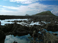
Statistics
Place: 201 out of 308 Avg (all users): 5.3614 Avg (commenters): 6.8333 Avg (participants): 5.2614 Avg (non-participants): 5.4161 Views since voting: 912 Views during voting: 341 Votes: 249 Comments: 10 Favorites: 0
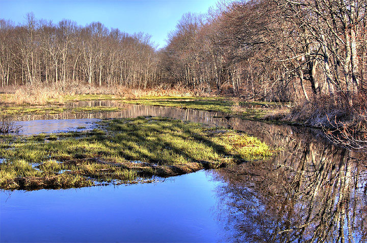
First of all, you did a lot of stuff right in this image: everything is sharp, the foreground water is pristine and a beautiful color of blue, and the reflection of the trees has a lot of contrast is pretty awesome. So why did it get a 5.36?
I think it is because it lacks a main subject, or at least something to draw your eyes. When I look at it, the blue catches my eyes first, then I'm led into the image but I'm left feeling like there isn't much to look at. The island is unremarkable and the trees behind are pretty dead. I only noticed the reflection later (which, IMO, is the best part of the image). Compositionally, it is ok, but without a center of interest it is hard to make a pleasing composition. Also, I get a little bit of an 'overprocessed' feeling from it -- especially in the background sky (haloing around the trees?).
How to fix it? Well, a slightly different vantage point might have helped the composition a lot, although it is difficult to spot something to center the image around. Possibly moving your right and focusing more on the reflection or, alternatively, taking a wider angle would help.
Assuming you can't retake the image, I think a recrop would help a lot -- crop it to the right and maybe remove some of the top, making the reflection more prominant. Even with that crop though, I think your viewers will still feel like something is lacking -- something in the background because that's where my eye tends to go. It was expert editing, so if you have a dog, kid, deer, etc you could have stuck them in a lighted area of the background and it would have given the viewer something to find. But, this was a landscape challenge so sticking a subject in is probably inappropriate...
And that may have been the main reason for your low score. When people think landscapes, they want to see large, sweeping areas of the world. Your view in this image might be a bit too restricted.
Another, random comment: I feel like there is a saturation imbalance in the image. With the saturation of the foreground water, I really want the woods in the background to be more colorful -- maybe warmer tones. There's not a hell of a lot you can do when the trees are still hibernating though :)
To summarize my rambling: technically a very good picture and pretty good processing on it. I think the low score resulted from a lack of something to draw the viewers eye and a 'contained' feeling instead of a 'huge area' feeling that most look for in landscapes. With a background subject, this could have been a really nice picture though -- the water and reflection is awesome.
FYI, I know how you feel. I took a picture for the landscape challenge (woods-covered hills) but when I went to process it I found that what I thought was beautiful at the time looked pretty boring when I looked at it. So I didn't bother submitting.
Thought I would add a comment of my own. I agree with Stings critique. The photo has a real mystical feel to it. I think it has a slight feeling of overprocessing, not sure in which area but it all looks a little too perfect. The grass is perfect, the water is perfect, the trees are perfect. Doesn't give anything the chance to really stand out. I was also wondering what it would look like if the area with the trees was a little darker as there is a large portion of the picture taken up with a very neutral grey. I still really love the shot and would be proud if I had taken it. Well done.
Crisp is right, it looks really sharp. Well done. My only gripe is the fairly prominent haloing above the trees (caused by the tone-mapping, I would imagine). Other than that, beautiful colors and processing in general.