| Author | Thread |
|
|
12/19/2003 09:21:36 PM |
Greetings from the Critique Club:
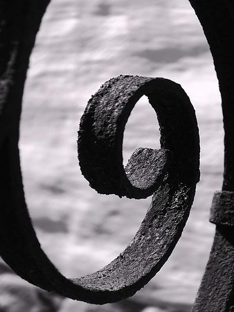
This image was one of my favorites in the challenge. It certainly meets the challenge definition and is quite original and interesting. I particularly liked the textures and the way they help to draw the eye up and around the curve. The compostion is nice and the softer focus at the edges does not distract from the stronger inner surface of the curve. The DOF throwing the background out of focus all together supports this as well. The way you have used the light to support the motion up and around the textured curve gives the image a nice depth and a lasting quality. Thanks for the image. |
|
Comments Made During the Challenge  |
|
|
12/14/2003 10:56:52 PM |
Nice abstract. Smooth motion of the shape with the rough texture of the rust. I think I may have liked to seen the color of the rust your title suggests.
Good sharp focus. I really like this. |
|
|
|
12/14/2003 09:13:49 PM |
| This is A perfect example of Less is More-- 10++ |
|
|
|
12/14/2003 11:49:49 AM |
| Good shot and use of DOF. I think this would have been nice in color or toned to go with the rust theme. Also, it would have been good to try to avoid the darker background detail at the bottom perhaps by shooting upward a bit more. Then you might have even included the top of the wider arc. |
|
|
|
12/12/2003 03:21:53 AM |
|
|
|
12/10/2003 09:58:59 AM |
| I think this would have worked better in color |
|
|
|
12/09/2003 10:07:54 PM |
| Lots of class in that shot, I can't give you a single reason why but i really like it. I think it had to the quality, the intangible qality (8) |
|
|
|
12/09/2003 06:21:38 PM |
|
|
|
12/09/2003 03:18:01 PM |
|
|
|
12/08/2003 11:55:23 PM |
| Nice angle and great textures. I wouldn't mind seeing a colored version after the challenge is over. |
|
|
|
12/08/2003 10:52:22 PM |
| I like the background... Nice work. |
|
|
|
12/08/2003 01:49:05 PM |
| One of the best captures of the challenge that wasn't a set-up still life. Lovely detail and composition. 9 |
|
|
|
12/08/2003 10:02:23 AM |
| I shot a similar photo for the "Simplicity" challenge, but haven't entered it yet. I may try something else now that I see your entry for this challenge. It's a nice shape, and the rusty texture adds to the effect. |
|
|
|
12/08/2003 09:20:55 AM |
I would have cropped this thighter and formatted the photo as a landscape, rather than a portrait. I believe you could have gotten 640X480 pixels to make it appear larger.
Other than that, great texture and shape combine to make this an interesting photo of an ordinary object. |
|
|
|
12/08/2003 05:29:04 AM |
| What a beautiful shot! Perfect for the challenge. Perfect dof and lighting. An interesting and appealing shot. 8 |
|
|
|
12/08/2003 02:10:38 AM |
| Great composition and overally great shot. Love it. |
|
Home -
Challenges -
Community -
League -
Photos -
Cameras -
Lenses -
Learn -
Help -
Terms of Use -
Privacy -
Top ^
DPChallenge, and website content and design, Copyright © 2001-2026 Challenging Technologies, LLC.
All digital photo copyrights belong to the photographers and may not be used without permission.
Current Server Time: 02/01/2026 11:46:11 AM EST.