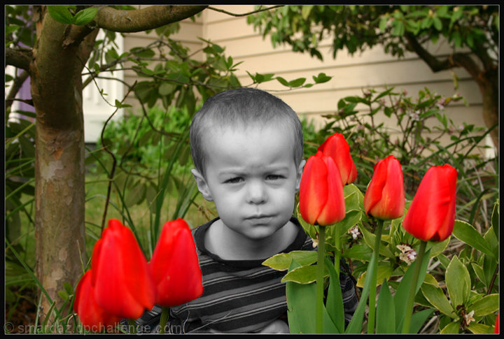
Duplicated layer, desat bottom layer,and background erased top layer. blurred around the edges of the erased area and pumped up the reds and greens
I like this picture but based on my passed experience,especially in free studies, i will be pleasantly surprised if it does better than a 5.3
Statistics
Place: 550 out of 573 Avg (all users): 4.5349 Avg (commenters): 4.5000 Avg (participants): 4.4538 Avg (non-participants): 4.7170 Views since voting: 988 Views during voting: 223 Votes: 172 Comments: 7 Favorites: 0
I kind of like this, but I knew it bombed as soon as I saw it was a challenge entry. Selective desat NEVER works in free studies. My experience anyway. Fun shot.
I understand about getting hammered in free studies but I don't limit myself to just that - it happens in other challenges as well. :p
I didn't look at the free study pics and I will say that this would have caught my eye because your desat choice is unusual here. I would have looked at this as you were trying to emphasize his gloomy mood amongst the pretty setting. But you know, we as people like to see human beings in color so to have a child there in black and white comes out as odd.
If you have not done it yet in the B/W Challenge (I'm only on page 28 out of 39 lol), I think it would be interesting to see what kind of reaction you would get if the whole pic were in black and white. I don't know if it would look better or not, but just an idea for you.
Compositionally, I like the different elements in the shot. The tree and house in the background give it a good context and backdrop. The tulips make a creative frame and contrast for the little boy's face. I think a tighter crop on the left, so that there is no "space" between the edge of the tree and the edge of the shot, would give this a more complete feel. As it is, it feels unbalanced to me because the tulips are closer to the edge on the right, than on the left, or because of the difference from the camera, it feels that way. For that matter, cropping closer to the edge of the flowers on the right might be a useful trim as well.
Technically, you have good focus, and good contrast between the focused areas of the shot (the boy, most of the flowers) and the out of focus house and greenery. The colors are nice. The muted yellow/tan of the house is a great contrast with the green and red.
The selective desaturation kills this shot, I am afraid. While it can be an interesting and effective technique, it has to be done judiciously. I think what hurts this one the most is that the selective part is more muted grays than a true black and white. Also, it doesn't seem to have much purpose in being desat., other than it is something you can do, although it does make the shot a bit more humorous.
Something I think might look interesting for this shot is to do a "handpainted" technique. It's not something I've done a lot, but I think it would look interesting here. Choose two or three main colors -- yellow for the house, red for the flowers, and a color or so for the boys shirt. Then, make the entire shot a bw, then paint the house with just a touch of yellow, the flowers with just a touch of red, and his shirt with whatever color you choose. Then, the colors can be faded to show the textures, patterns, whatever, underneath the color.
OR you could desaturate the whole shot so that there is just a hint of color throughout.
The little boy's expression is priceless. Hope he wasn't too disgruntled.
If I need to further explain or clarify myself, please feel free to contact me.
Karma
im sorry but the desat is not working here for me.. the tulips are way too red and saturated and the boy is... just doesnt work for me.. its like a snapshot that was edited to try to be more than a snapshot and it didnt come out well.