| Author | Thread |
Comments Made During the Challenge  |
|
|
12/09/2003 05:00:13 PM |
| i would like to see something else in the shot that ties this to money. as it is, the shot depends on the title too much. |
|
|
|
12/09/2003 01:57:31 PM |
|
|
|
12/08/2003 07:40:26 PM |
| Good attempt at composition. |
|
|
|
12/07/2003 03:23:05 PM |
|
|
|
12/07/2003 02:43:41 PM |
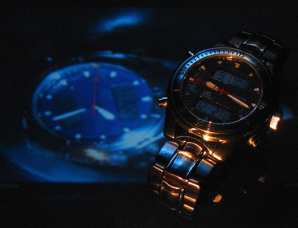
| Neat effect, I like the lighting |
|
|
|
12/06/2003 08:59:28 AM |
|
|
|
12/06/2003 07:57:54 AM |
| the most interesting time composition! well done! |
|
|
|
12/06/2003 05:03:14 AM |
| Love the color combination. But the watch on the right is too dark for my taste, the left one draws more attention, feels out of balance. |
|
|
|
12/05/2003 12:43:16 PM |
| The lighting doesn't really work for me. |
|
|
|
12/05/2003 07:49:22 AM |
|
|
|
12/05/2003 06:07:19 AM |
Technical: Fits the challenge but not very original. Composition and focus are good, lighting and exposure crete a mood but still look a little too dark for my taste.
Personal: I like the blue tones. I wish the front watch was a little easier to see.
My vote: 6 |
|
|
|
12/04/2003 12:45:57 PM |
| Good lighting. I like the background. |
|
|
|
12/03/2003 12:07:43 PM |
| Lots of photos using the Time is Money theme. This is one of the best interpretations. Love the lighting. |
|
|
|
12/02/2003 08:34:44 PM |
| I love the warm lights on the watch. Not sure about the background though... Makes the whole look a bit busy... But it might be just me... 8 |
|
Home -
Challenges -
Community -
League -
Photos -
Cameras -
Lenses -
Learn -
Help -
Terms of Use -
Privacy -
Top ^
DPChallenge, and website content and design, Copyright © 2001-2025 Challenging Technologies, LLC.
All digital photo copyrights belong to the photographers and may not be used without permission.
Current Server Time: 04/07/2025 12:50:36 PM EDT.