| Author | Thread |
Comments Made During the Challenge  |
|
|
12/08/2003 12:03:18 PM |
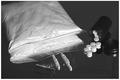
| In my opinion too dark. Not enough light to make the objects stand out well. |
|
|
|
12/07/2003 12:10:31 PM |
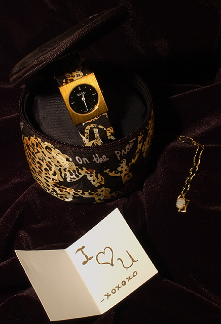
| I like this But there is something about the angle mabe.... I would have brought it all a bit closer as well..... Focus is realy good. |
|
 Photographer found comment helpful. Photographer found comment helpful. |
|
|
12/05/2003 08:54:07 PM |
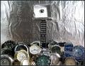
| needs to be a bit brighter or more contrast everything blends together |
|
|
|
12/04/2003 03:20:21 PM |
| Nice idea, I think I would include a little more light, or a different colored background - It matches the camera case, but the two seem blend together and are hard to distinguish - this is really only a slight issue though. Cropping is well done and the subject conveys the topic well. -7- |
|
| Photographer found comment helpful. |
|
|
12/04/2003 12:57:12 PM |
| Good color, I like the detail. |
|
| Photographer found comment helpful. |
|
|
12/02/2003 08:36:49 PM |
| Looks like a very nice photo... 8 |
|
|
|
12/02/2003 08:01:06 PM |
| Composition-wise, I think the card grabs too much attention away from the viewer but I *think* your main subject is supposed to be the more expensive items above the card? |
|
| Photographer found comment helpful. |
Home -
Challenges -
Community -
League -
Photos -
Cameras -
Lenses -
Learn -
Help -
Terms of Use -
Privacy -
Top ^
DPChallenge, and website content and design, Copyright © 2001-2025 Challenging Technologies, LLC.
All digital photo copyrights belong to the photographers and may not be used without permission.
Current Server Time: 04/07/2025 01:03:03 PM EDT.