| Author | Thread |
Comments Made During the Challenge  |
|
|
09/01/2002 11:44:00 PM |
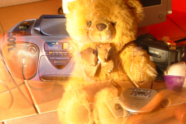
| I think this is a shutter speed trick. Not real familiar with it, so i could be wrong. I like how you have them kind of dissapearing into the "newer" toys. the lighting is very nice and I like the framing. great shot and good luck in the challenge. |
|
|
|
09/01/2002 03:00:00 PM |
| A darker floor would have made this picture a little better. 6. |
|
|
|
09/01/2002 10:42:00 AM |
| cool effect on this one...nice! |
|
|
|
08/30/2002 07:11:00 AM |
| nice technique, how did you achieve it? How long was the shutter speed. Good concept, well carried out. |
|
|
|
08/30/2002 06:49:00 AM |
| Love your concept here. I think I would have liked to have seen these two shots taken in the same place and from the same angle. They dont quite gel for me. Good light and balance of elements, though. 8 - floyd |
|
|
|
08/30/2002 05:12:00 AM |
Clever idea - makes me look and look again.
6, Kavey |
|
|
|
08/29/2002 05:43:00 PM |
| very interesting time exposure, maybe a bit too long--kind of bright, i struggled to see the cell phone and the other thing on the bottom right that looks wooden, but cool none the less 6 |
|
|
|
08/29/2002 08:58:00 AM |
|
|
|
08/28/2002 05:56:00 PM |
REALLY cool and soooo true. I like this one very much. 9
Ruthann |
|
|
|
08/28/2002 01:18:00 PM |
| Great effect. The color seems a bit off, but that makes it seem even "dreamier" or passing. karmat |
|
|
|
08/28/2002 07:42:00 AM |
| Very interesting and thought provoking. If I were to be picky I would ask the significance of the wood arm rest in the lower right corner. Lnede |
|
|
|
08/27/2002 09:06:00 PM |
Composition: Subject Placement, Cropping, Background7,
Technical: Focus, Exposure, Lighting, Processing9,
Challenge: Does your entry meet it?7,
Appeal: Is it Interesting, Motivating, Etc.? 7,
Total Averaged Rating8. Autool
|
|
|
|
08/27/2002 03:21:00 PM |
| Nice effect. The concept is good, the execution is better than I could do, but it still doesn't quite look "good". The bear is overly bright on the left, blah, blah, blah. I think there are too many elements both, partly visible and fully visible, makes it look cluttered. Maybe two of each would have been more dramatic. 8 Swash |
|
|
|
08/26/2002 06:04:00 PM |
|
|
|
08/26/2002 05:33:00 PM |
|
|
|
08/26/2002 05:17:00 PM |
|
|
|
08/26/2002 12:38:00 PM |
|
|
|
08/26/2002 03:00:00 AM |
| Beautifully done with the blurring to convey two different phases in life. Wonder how you did that. Will revisit this lateron this week. Prelim: 7 Journey |
|
|
|
08/26/2002 02:19:00 AM |
| I like how this picture tells a story of passing years |
|
|
|
08/26/2002 01:23:00 AM |
| This is a cool idea for the challenge. I like it, the more modern stuff is sharper than the younger kid stuff. |
|
|
|
08/26/2002 01:18:00 AM |
| A very interesting concept.. growth! I think this was very well done. The lighting is a tad .. harsh? Bright? 7 |
|
Home -
Challenges -
Community -
League -
Photos -
Cameras -
Lenses -
Learn -
Help -
Terms of Use -
Privacy -
Top ^
DPChallenge, and website content and design, Copyright © 2001-2026 Challenging Technologies, LLC.
All digital photo copyrights belong to the photographers and may not be used without permission.
Current Server Time: 02/01/2026 06:33:35 AM EST.