Greetings from the Critique Club.
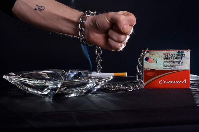
This photo conveys a definite message and is technically very well done. The low key treatment is perfect for the photo's purpose, and exposure and focus are perfect. The elements of the photo are nicely arranged. The picture is dominated by the horizontal and vertical lines of the cigarette, ashtray, pack, and chain, which suggests stability. This is in stark contrast to the diagonal arm with clenched fist, which makes the message of "I want to quit" even stronger.
I especially like the tattoo of the scorpion, a symbol of treachery that is certainly appropriate for the idea here. It's just the right size, large enough to be noticable but not so large as to compete with the main elements. Another nice touch is how the smoke connects the cigarette to the chain, which is certainly rife with meaning.
There are two compositional items that could be improved. First, the camera should be tilted up a bit. The negative space at the bottom doesn't do anything for the photo, but it really needs some negative space at the top for better balance. Second, the top half of the cigarette pack is too busy and too light; it detracts from the rest of the photo. I love the red color of the bottom half; a prop pack with that color and clearly labeled "cigarettes" would do a lot for the photo.
Overall lighting is great, especially on the ashtray where the brightness is pleasing and a welcome contrast from the overall darkness. But the bright spots on the hand and behind the pack are distracting. Perhaps a snoot on your rear light would have helped. |