| Author | Thread |
|
|
01/16/2004 12:47:21 PM |
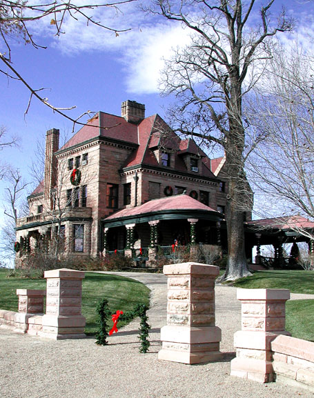
| Very Nice Picture of the Rosemount!! Which day you taken the picture. |
|
 Photographer found comment helpful. Photographer found comment helpful. |
|
|
12/10/2003 04:49:24 AM |
Greetings from the critique club,
Negative: under exposed in the foreground, yet dark on the "porch"
Might have benefited from a tighter crop....I'm not married to that idea, however.
Positive:
Nice choice of subject,
Good capture on sky,
Nice composition,
Nice saturation, clarity, focus
all in all I like this picture
jo
|
|
| Photographer found comment helpful. |
Comments Made During the Challenge  |
|
|
12/08/2003 09:37:00 PM |
| Beautiful! I would crop a little more at the bottom and show more of the sky and will lower the house a little bit for a better rule of thirds. 7 |
|
| Photographer found comment helpful. |
|
|
12/08/2003 12:22:00 PM |
| Georgeous photo. What are the two green things and one red thing between the columns? Just curious. |
|
| Photographer found comment helpful. |
|
|
12/07/2003 09:21:58 PM |
| A bit of amputation on the right distracts |
|
| Photographer found comment helpful. |
|
|
12/07/2003 02:37:20 PM |
| Nice shot, love the colors... |
|
| Photographer found comment helpful. |
|
|
12/06/2003 10:30:14 PM |
| Nicely done. This photo looks surreal. |
|
| Photographer found comment helpful. |
|
|
12/06/2003 04:31:05 PM |
| It seems as though you cropped it too tight on the right side. |
|
| Photographer found comment helpful. |
|
|
12/06/2003 09:03:19 AM |
| I love the title and the composition with the tree and the wall abutments. Thats really a fantastic angle to take a picture of a house. However- it occurs to me that scattered around chinese restaurants and laundromats are books and books full of house pictures. This one might say "large 15 room stone victorian mansion- 1.5 million." |
|
| Photographer found comment helpful. |
|
|
12/05/2003 02:34:07 PM |
| Lighting a bit harsh but great idea and nice subject. - 8 |
|
| Photographer found comment helpful. |
|
|
12/04/2003 04:46:56 PM |
| The branch on the left is just 'in the way' -- like the contrast of the sharp green of the grass and strong blue of the sky. Just that pesky branch =) |
|
| Photographer found comment helpful. |
|
|
12/04/2003 01:23:17 PM |
| Good colors, I like the detail. |
|
| Photographer found comment helpful. |
|
|
12/03/2003 03:32:51 PM |
| Nice image but the columns at the entrance of the walkway are overexposed. I get tricked like by stone all the time. Who would think that such a material could be so relective. Maybe this could have been slightly corrected with a polarzing fiter. It would have helped the sky too. Nice composition |
|
| Photographer found comment helpful. |
|
|
12/03/2003 01:06:12 PM |
Nice colors and focus and DOF. Great composition. Not much for staying power though. I also thing that it's kind of a stretch fitting the competition with the title...
TC |
|
| Photographer found comment helpful. |
|
|
12/03/2003 10:37:34 AM |
|
| Photographer found comment helpful. |
|
|
12/03/2003 05:38:29 AM |
| Beautiful home, wish I lived there! |
|
| Photographer found comment helpful. |
|
|
12/03/2003 03:28:20 AM |
| The contrast seems a bit heavy on the house, with dark areas too black against the rest. |
|
| Photographer found comment helpful. |
|
|
12/02/2003 10:39:35 PM |
| Beautiful photo. Little over exposed maybe on the wall, but otherwise perfect. |
|
Home -
Challenges -
Community -
League -
Photos -
Cameras -
Lenses -
Learn -
Help -
Terms of Use -
Privacy -
Top ^
DPChallenge, and website content and design, Copyright © 2001-2025 Challenging Technologies, LLC.
All digital photo copyrights belong to the photographers and may not be used without permission.
Current Server Time: 04/07/2025 05:57:31 AM EDT.