| Author | Thread |
|
|
04/10/2007 08:27:20 PM |
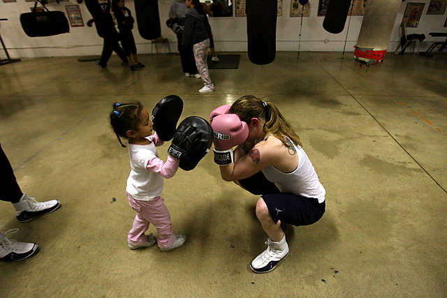
Thanks all for the comments.
I guess I should explain the angle and composition I chose because I got so many suggestions on it.
I shot down on the mother and child because standing at their level had them lost in the background (I did make photos like this)...and this was cleaner.
I shot this wide because, while I wanted to keep the subjects isolated I wanted to keep the punching bags in the frame to contribute information as to the type of the environment they were in.
I do wish that leg on the left were gone, but it was there in real life ..and so I leave it there. The moment was past when the leg was gone, so while the image could have been cleaner, the moment between mother and child was lost. Looking through the comments and looking at the photo again, it was probably too wide..but I still would want to keep the bags and background elements there.
Hope this doesn't come off as an excuse, but it's an explanation of wwhy I shot it this way. To tell a story and not so much to look as pretty...(though I did want it to look pretty).
|
|
Comments Made During the Challenge  |
|
|
04/10/2007 04:54:46 AM |
| this is quite good. would been better if these two were not in the center of the capture.. |
|
 Photographer found comment helpful. Photographer found comment helpful. |
|
|
04/10/2007 01:32:58 AM |
| the background distractions spoil this...if you moved in closer and cut out all the legs in the background this would have been great... |
|
| Photographer found comment helpful. |
|
|
04/09/2007 04:04:40 PM |
| Very cute presentation... ilove it... |
|
| Photographer found comment helpful. |
|
|
04/09/2007 09:57:21 AM |
| I think a better crop would have focused more on the two main subjects which would have added a more emotional connection to an otherwise sweet image. |
|
| Photographer found comment helpful. |
|
|
04/09/2007 08:35:10 AM |
|
|
|
04/07/2007 11:04:22 AM |
| a lower angle would have made it a lot better, still like it though |
|
| Photographer found comment helpful. |
|
|
04/06/2007 03:01:34 PM |
| OK, so next time get down on the same level as your subject. Makes for a much stronger photo. 6. |
|
| Photographer found comment helpful. |
|
|
04/06/2007 03:55:09 AM |
| Its really nice - a tighter crop wud have made this even more beautiful. The feet on the left side and the leg of the woman on the back distracts the focus from the mother and the kid 7 |
|
| Photographer found comment helpful. |
|
|
04/06/2007 12:30:38 AM |
|
|
|
04/05/2007 09:50:43 AM |
| Should have crouched to get a better POV |
|
| Photographer found comment helpful. |
|
|
04/05/2007 06:41:40 AM |
I really like this photo. There is a warm family feel to it. I enjoy how it gives a feminine side to such a masculine sport.
I would've liked it better if you zoomed in or croped the top of the photo to take away the trainers in the back. They are a bit distracting. |
|
| Photographer found comment helpful. |
|
|
04/05/2007 02:57:17 AM |
| Maybe a closer shot would have attracted better the attention on the subject |
|
| Photographer found comment helpful. |
|
|
04/04/2007 01:25:32 PM |
|
| Photographer found comment helpful. |
|
|
04/04/2007 11:48:47 AM |
| I think this would have been better as a tighter composition, as it is the clutter around the ages is pretty distracting. |
|
| Photographer found comment helpful. |
|
|
04/03/2007 11:32:27 PM |
| Really, when you phtograph kids, get down to their level. |
|
| Photographer found comment helpful. |
Home -
Challenges -
Community -
League -
Photos -
Cameras -
Lenses -
Learn -
Help -
Terms of Use -
Privacy -
Top ^
DPChallenge, and website content and design, Copyright © 2001-2025 Challenging Technologies, LLC.
All digital photo copyrights belong to the photographers and may not be used without permission.
Current Server Time: 04/07/2025 04:54:41 AM EDT.